Second Semester Art 1(B)
Projects!
On this page you will find information about each project, notes, updates on due dates or any other pertinent information about what is happening currently in class.
Elements of Art and Principles of Design
These are all important to your overall success as an art student. the elements and principles are essential the framework of any work of art, be it amateur or professional. If you associate yourself with these terms and how to use them they will help you to be more successful.
|
|
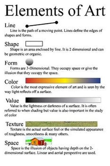
Elements of Art
1. Shape = An element of art, an enclosed space defined by other art elements such as line, color, and texture.
2. Form = An element of art that appears three-dimensional and encloses volume such as a cube, sphere, pyramid or cylinder
3. Space = An element of art that indicates areas between, around, above, below, or within a composition, there are two kinds of space positive and negative.
4. Texture = is the surface quality of an artwork usually perceived through the sense of touch; however texture can also be implied, perceived visually though not felt through touch.
5. Line = An Element of art that is used to define space, contours and outlines or suggested mass and volume.
6. Color = An element of art with three properties: hue, value, and intensity. Also the character of surfaces created by the response of vision to wavelengths of reflected light
7. Value = an element of art concerned with the degree of lightness or darkness
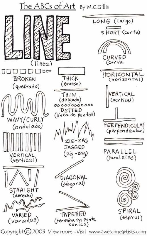
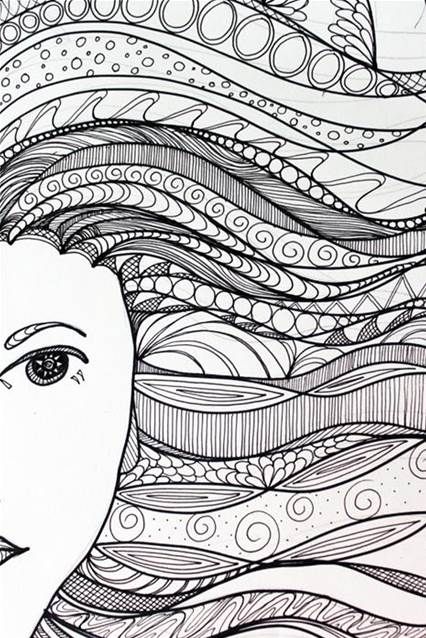
Line
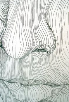
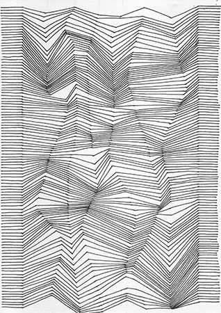
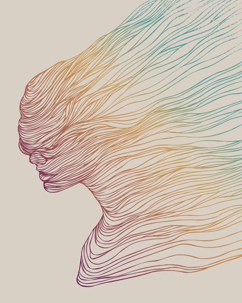
Bellow you will see an example of a line worksheet. Yes you could do something like this but at the same time this is for a high school class(even a level one) oversimplified and extremely basic.
Value
We also started Value today(1/28/16) and discussed the proper use of drawing pencils/a pencil in general. Value as we have already discussed is one of the most important elements that you will be assessed on throughout the semester.

|
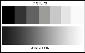
In class today we discussed three different value scales. The first was the gradiated scale, this is what we see in real life. In this scale values fade smoothly from dark to light without any clear line of change being present. The second was step value which is shown at the top of the image to the left. In this scale values are flat and the change from one step to the next is great enough to create a line of change between each step.
|
|
The third scale is cross-hatching which is a technique used to create value, this scale could be created as step or as gradiated based on the individual students taste.
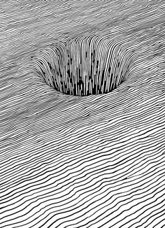
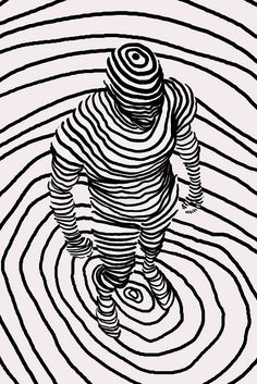
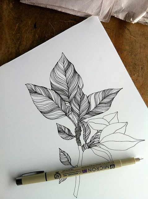
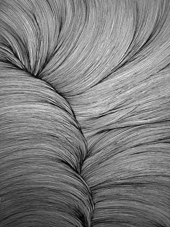
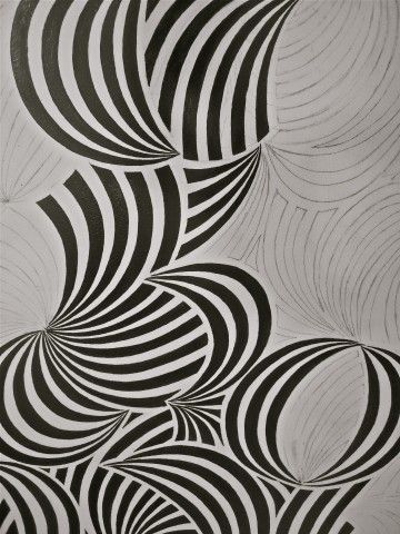
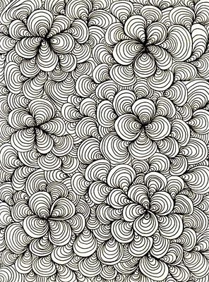
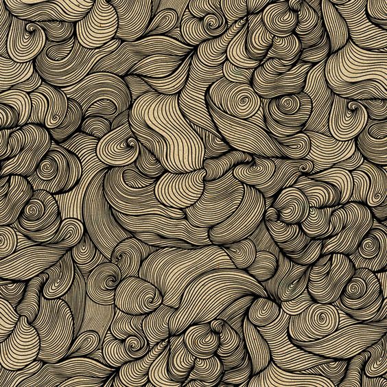
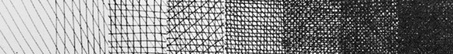
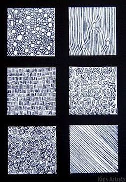
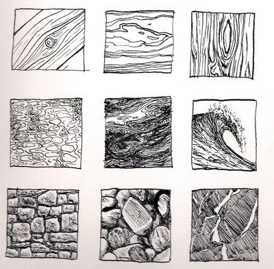
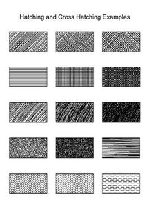
Texture
|
|
|
|
Above you can see some examples of texture, often times these combine numerous different elements but thinking back to yesterday if you notice many of them use line. Also if you notice as you look at these there is never JUST one way to create a texture. There is always numerous options out there, the key is finding which way works best for you. Specifically look at the wood grains shown here. There are five different examples of wood grain above, every single one is done just a little bit differently. Same goes for stone, and if you do some looking for yourself you will find the same can be said for almost every texture that exists.
Below is a link to a page that will walk you through step by step how to create a few different textures. Again though remember that this is only one way to do this, for each one of these shown bellow there are other options to create textures representing the same things. If you scroll down the page further you will see numerous different examples of texture creation that may be useful to you as well.
https://www.pinterest.com/pin/499055202435333844/
https://www.pinterest.com/pin/499055202435333844/
Click to set custom HTML
Space
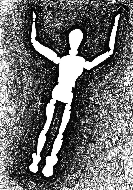
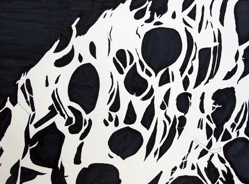
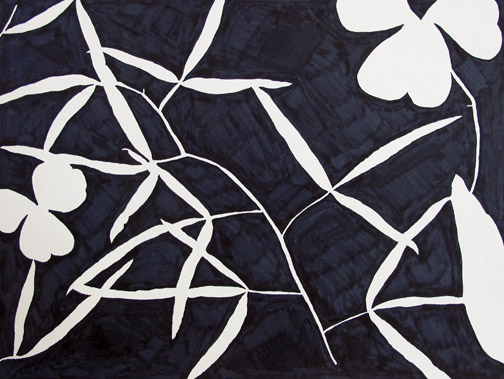
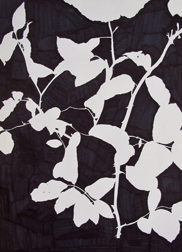
Quick refresher to start off, to this point we are talking about space using two different kinds of space. Positive space, being anywhere you have line, color, value, texture....pretty much anything. Or negative space which is blank and empty. The objective is to distribute your positive and negative space throughout your work and to make sure that they are balanced. Bellow are some examples of this.

FORMS
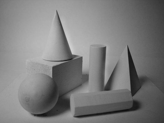
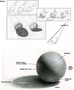
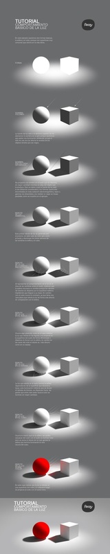
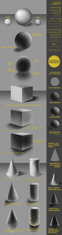
As you start to wrap up with the Gradiated, step, and cross hatching value scales its time to now take that value and start to apply it to start creating forms. These are all examples of how the forms can be shaded and how light reacts differently all the time. There are many different variables that must be taken into account when you are shading anything in an attempt to create realism. Angle of the light, the number of different light sources, and the texture or surface of the object being drawn are good places to start with. For our forms in an attempt to standardize what we are trying to create there is one light source coming from the upper right hand side of your forms.


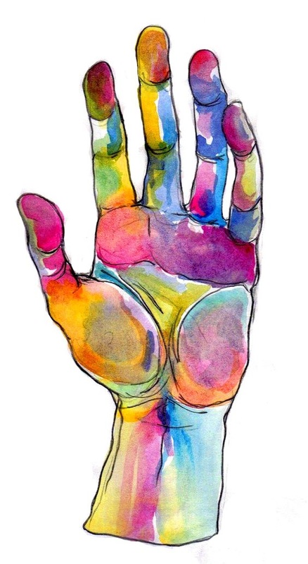
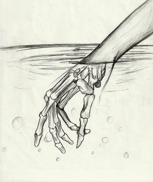
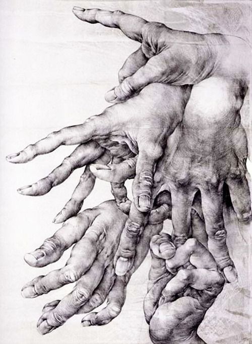
Observational Drawing
Drawing from observation is one way that art students as well as artists in general produce realistic imagery as well as hone their craft. One of the hardest lessons to learn for anyone is that they must learn to "draw what they see rather then what they think they see." In essence do you know what a tree looks like? How a bout a Honda civic, or a mustang, or your hands? Can you draw any of those things 100% accurately and make it look realistic without being able to look at it? The answer is no, no you cant. Most people cant because most of us are not gifted with a photographic memory. For the majority of us an accurate image of anything that we just saw remains in our brains for approximately 3 seconds, and that's on the long end of that approximation.
This s one reason that artists do what are called sketches, studies, or thumbnails. Each have a different focus which we will get into later but for the most part the idea is to start putting down on paper the things that we see and setting up a good composition without investing hours into a work only to find out that your compositions not going to work. What is a composition? a composition is simply the purposeful combination of the elements and principles of art.
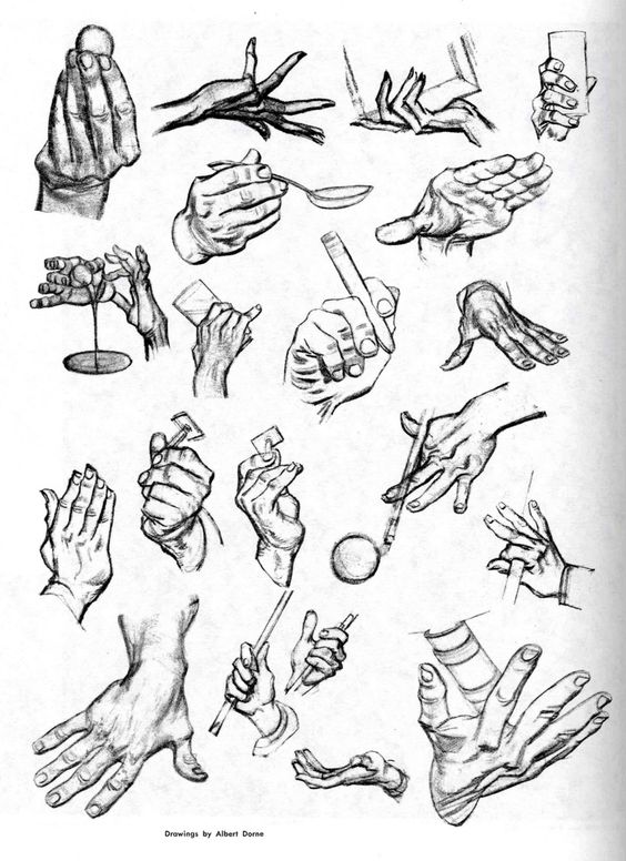
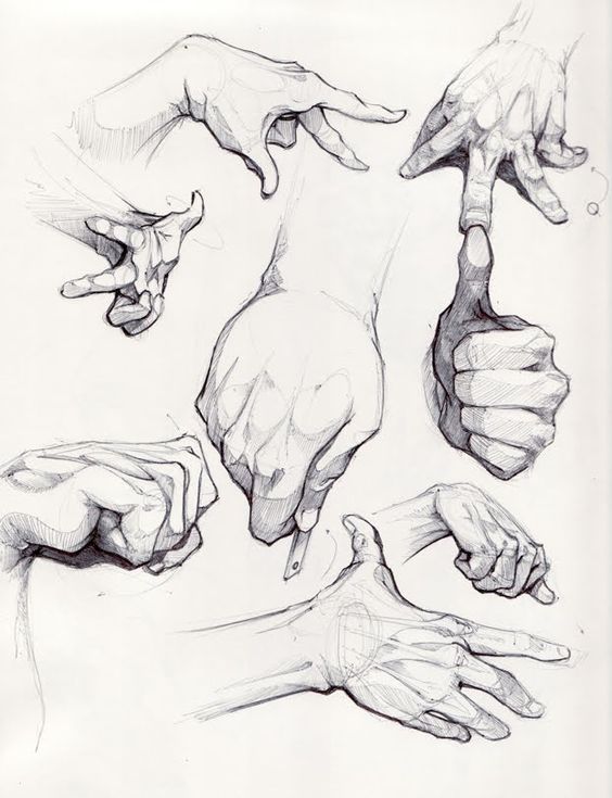
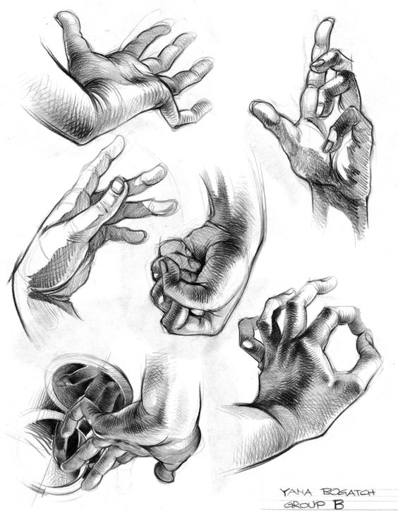
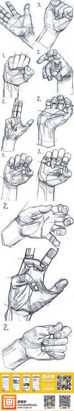
Today we are going to go over how to create one as well as what a sketch is and how to do them. Our initial focus will be on our hands, partially due to the fact that everyone has them with them and no one needs any kind of reference images in order to draw them. Also because the hands are one area that I have over the years found numerous individuals struggle with. Often times to the point where it hinders their ability to draw the human figure because they are always trying to figure out how to hide the hands.
This s one reason that artists do what are called sketches, studies, or thumbnails. Each have a different focus which we will get into later but for the most part the idea is to start putting down on paper the things that we see and setting up a good composition without investing hours into a work only to find out that your compositions not going to work. What is a composition? a composition is simply the purposeful combination of the elements and principles of art.
Today we are going to go over how to create one as well as what a sketch is and how to do them. Our initial focus will be on our hands, partially due to the fact that everyone has them with them and no one needs any kind of reference images in order to draw them. Also because the hands are one area that I have over the years found numerous individuals struggle with. Often times to the point where it hinders their ability to draw the human figure because they are always trying to figure out how to hide the hands.
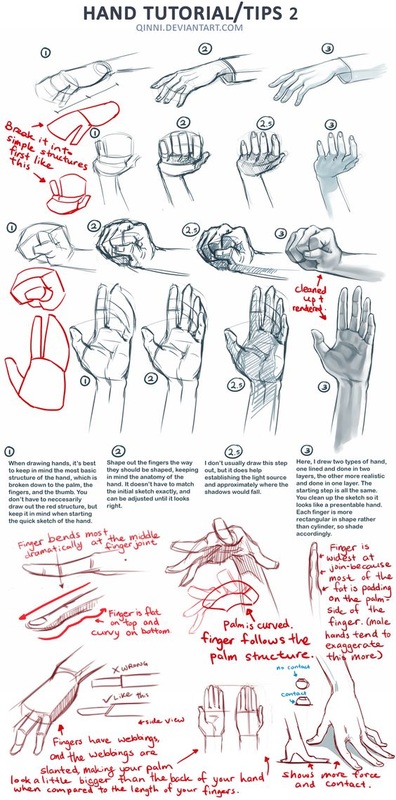
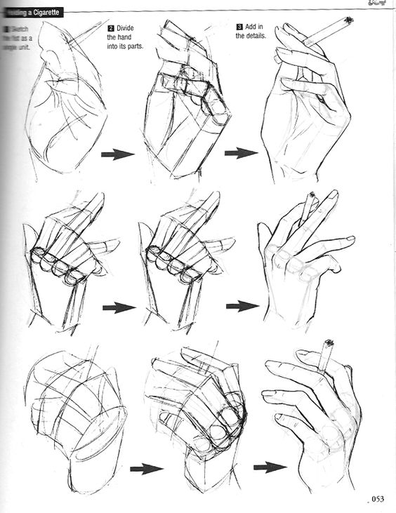
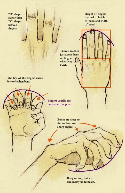
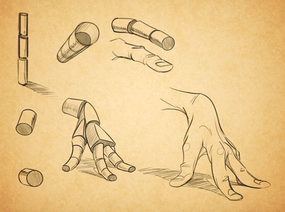
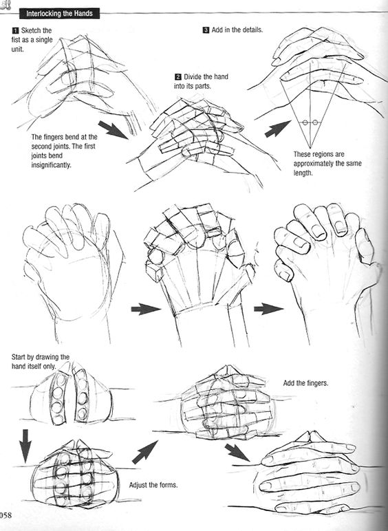
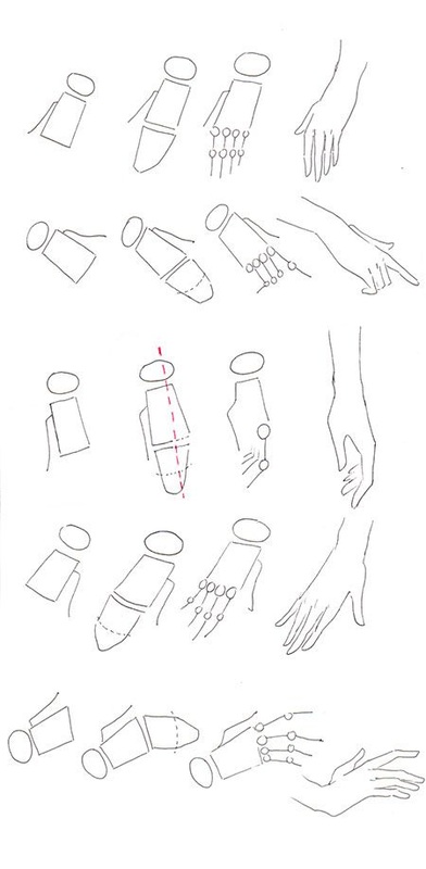
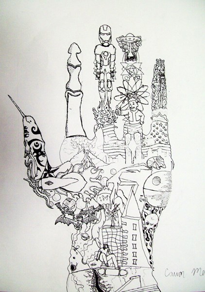
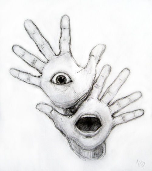
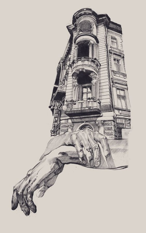
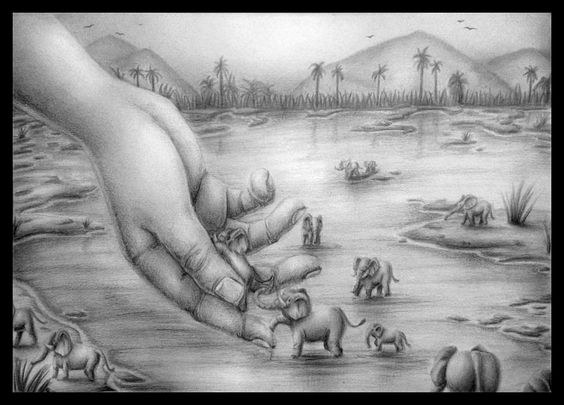
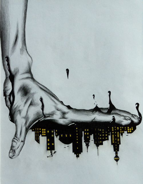
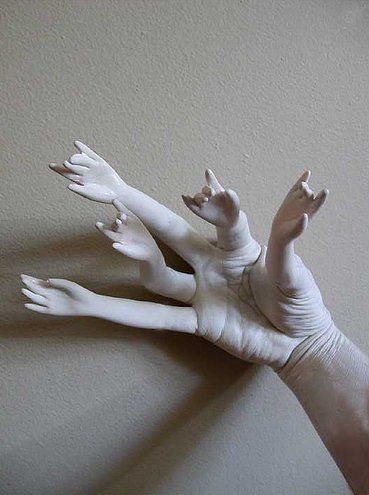
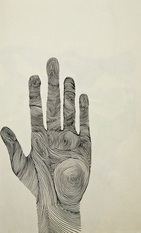
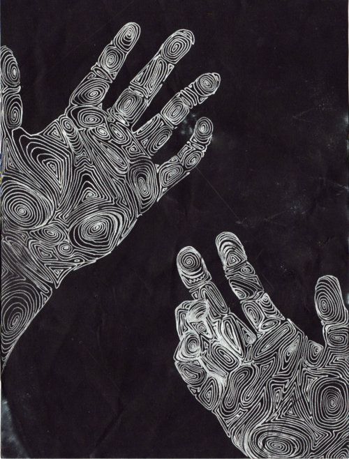
The six images above are all different references images for technique and strategies that help to break the hand down into simple shape to start out. From that shape you start to add value and refine the lines around the hand in order to build to the form and finally the detail. To start out we are going to do ten different sketches of our hands focusing on form and proportion. Bellow are some examples of slightly more in-depth drawings of hands which are often called studies. The difference between a study and sketch is the level of shading and detail, and obviously the amount of time spent on each.
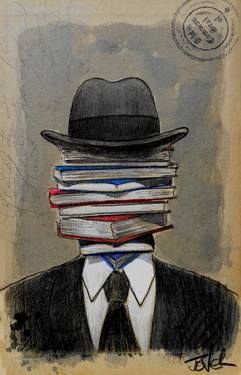
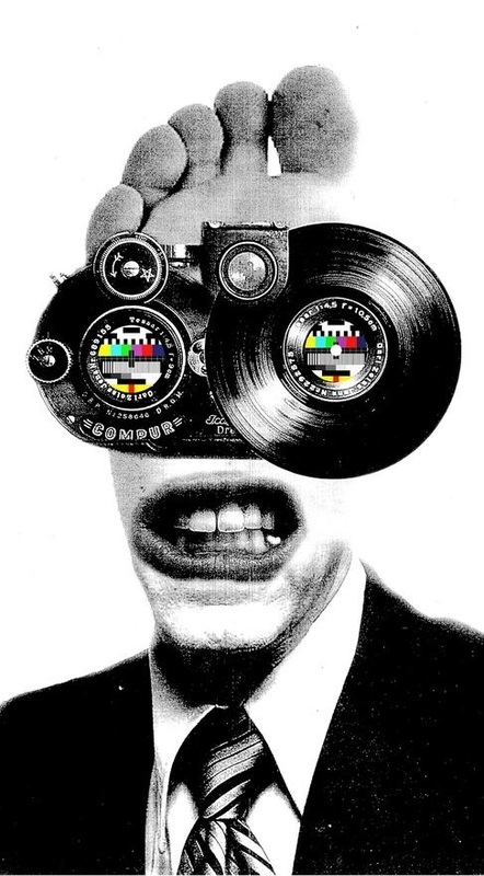
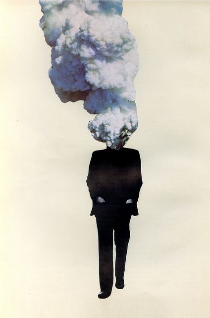
Synectic Trigger mechanisms
- Subtract = Simplify, omit, remove certain parts or elements. Take something away from your subject. Compress it, make it smaller. Think: What can be eliminated, reduced, or disposed of? What rules can you break? How can you simplify, abstract, stylize or abbreviate?
- Repeat = Repeat a shape, color, form, image or idea. Reiterate, echo, restate or duplicate your reference subject in some way. THINK: How can you control the factors of occurrence, repercussion, sequence and progression?
- Combine = Bring things together. Connect, arrogance, link, unify, mix, merge, wed, rearrange. Combine ideas, materials and techniques. Bring together dissimilar things to produce synergistic integration's. THINK: What else can you connect to your subject? What kind of connections can you make from different sensory modes, frames of reference or subject disciplines?
- Add = Extend, expand, or otherwise develop your reference subject. Augment it, supplement, advance or annex it. Magnify it: make it bigger. THINK: What else can be added to your idea, image, object, or material?
- Transfer = Move your subject into a new situation, environment or context. Adapt transpose, relocate, dislocate. Adapt the subject to a new and different frame of reference. Move the subject out of its normal environment; transpose it to a different historical, social, geographical or political setting or time. Look at it from a different point of view.
- Empathize = Sympathize. Relate to your subject; put yourself in its shoes. If the subject is inorganic or inanimate, think of it as having human qualities. how can you relate to it emotionally or subjectively?
- Animate = Mobilize visual and psychological tension in a painting or design. Control the pictorial movements and forces in the picture. Apply factors of repetition, progression, serialization or narration. Bring life to inanimate subjects by thinking of them as having human qualities.
- Superimpose = Overlap, place over, cover, overlay: Superimpose dissimilar images or ideas. Overlay elements to produce new images, ideas or meanings. Superimpose different elements from different perspectives, disciplines or time periods on your subject. Combine sensory perceptions (sound/color, etc). Think: What elemtns or images from different frames of reference can be combined in a single view? Notice, for example, how cubist painters superimposed several views of a single object to show many different movements in time simultaneously.
- Disguise = Camouflage, conceal, deceive or encrypt: How can you hide, mask or implant your subject into another frame of reference? In nature, for example, chameleons, moths and certain other species conceal themselves by mimicry: Their figure imitates the ground. Think: Subliminal imagery can create a latent image that will communicate subconsciously, below the threshold of conscious awareness, this is an extreme example of disguised imagery.
- Contradict = contradict the subjects original function. Contravene, deny, reverse: many great works of art are, in fact, visual and intellectual contradictions. They may contain opposite, antipodal, antithetical or converse elements which are integrated in their aesthetic and structural form. They may also contradict laws of nature such as gravity, time, etc. THINK: How can you visualize your subject in connection with the reversal of laws of nature, gravity, magnetic fields, growth cylcles, proportions; mechanical and human functions, procedures, games, rituals, or social conventions?
- Parody = Ridicule, mimic, mock, burlesque or caricature: Make fun of your subject, "roast" it, lampoon it. Transform it into a visual joke or pun. Exploit the humor factor, make zany, ludicrous or comic reference. Create a visual oxymoron or conundrum.
- Change Scale = Make your subject bigger or smaller. Change proportion, relative size, ratio, dimensions or normal graduated series.
- Substitute = Exchange, switch or replace: THINK: What other idea, image, material or ingredient can you substitute for all or part of you subject?
- Isolate = Separate, set apart, crop, detach: Use only a part of your subject. in composing a picture, use a viewfinder to crop the image or visual field selectively. "crop" your ideas, too, with a "mental" viewfinder. THINK: What element can yo detach or focus on?
- Distort = Twist your subject out of its true shape. Proportion or meaning: THINK what kind of imagined or actual distortions can you effect? How can you misshape it? Can you maint5ain or produce a unique metaphoric and aesthetic quality when you misshape it?
- Prevaricate = Equivocate Fictionalize bend the truth, falsify, fantasize Although telling fibs is not considered acceptable social conduct it is the stuff that legends and myths are made of. THINK How can you use your subject as a theme to present information?
- Analogize = Compare Draw associations: Seek similarities between things that are different make comparisons of you subject to elements from different domains. What Logical and illogical associations can you make?
- Hybridize = Cross-fertilize we your subject with an improbable mate. Think: What would you get if you crossed a _____ with a _____? Organic/mechanical, use of color from and structure.
- Metamorphose = Transform, convert, Trans-mutate: Depict you subject in a state of change it can be a simple transformation (an object changing its color, for example. Think of the cocoon to butterfly types of transformations, aging, structural progressions, as well as radical and surreal metamorphosis such as Jekyll and Hyde.
- Symbolize = How can your subject be imbued with symbolic qualities. A visual symbol is a graphic device which stands for something other then what it is. Public symbols are cliches insofar as they are well-known and widely understood. While private symbols are cryptic and have special meaning only to their originator works of art are often integration's of both public and private symbols.
- Mythologize = Build a myth around your subject. In the sixties pop artist mythologized common objects like coca- cola, Campbell soup brillo pads, comic strip characters, movie start mass media images, hot rods, burgers……
- Fantasize= Use it to trigger surreal, preposterous, outlandish, outrageous, bizarre thoughts Topple mental and sensory expectations. What if automobiles where made of brick? What if night and day occurred simultaneously?
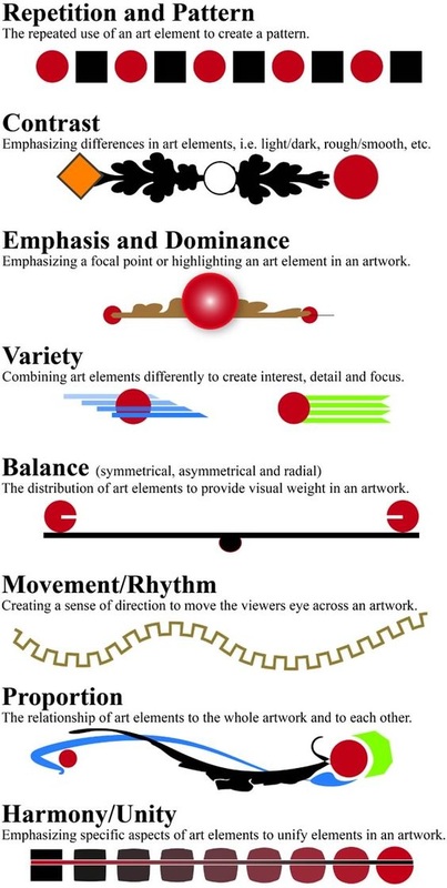
Principles of Design
1. Unity = A principle of design related to the sense of wholeness that results from the successful combinations of the elements of art.
2. Variety = The use of several elements of design to hold the viewer’s attention and to guide the viewer’s eye through and around the work of art.
3. Emphasis = A principle of design in which one element, or a combination of elements, create more attention than anything else in a composition. The dominant element is usually a focal point in a composition and contributes to unity by suggesting that other elements are subordinate to it.
4. Balance = The equal distribution of positive and negative space throughout a work of art so that no portion of the work visually weighs more.
5. Proportion = A principle of art reflecting the size relationship of parts to one another and to a whole.
6. Pattern = The repetition of elements or combinations of elements in a recognizable organization, also could be the repeating of an object or symbol all over the work of art.
7. Rhythm = Is created when one or more elements of design are used repeatedly to create a feeling of organized movement. Rhythm creates a mood like music or dancing. To keep rhythm exciting and active, variety is essential.
8. Movement = The path the viewer’s eye takes through the work of art, often to focal areas. Such movement can be directed along lines, edges, shape, and color within the work of art.
9. Repetition = The repetition of elements of art to create unity within the work of art (line, color, shape, form).
Composition
Pen and Ink
Pen and ink will start with a skills sheet almost exactly like what you did for the first value scale. It will be three rows(side to side) and 7 columns(up and down) consisting of the three different pen and ink shading techniques, stippling(dots), hatching(line), and crosshatching(also line) which you have already done.

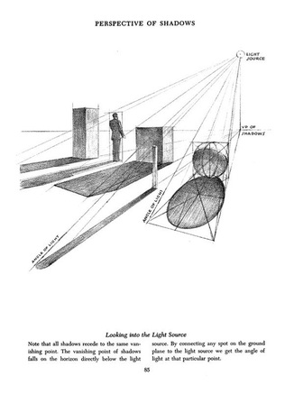
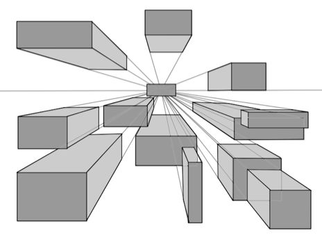
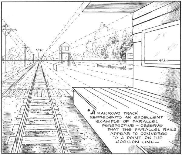
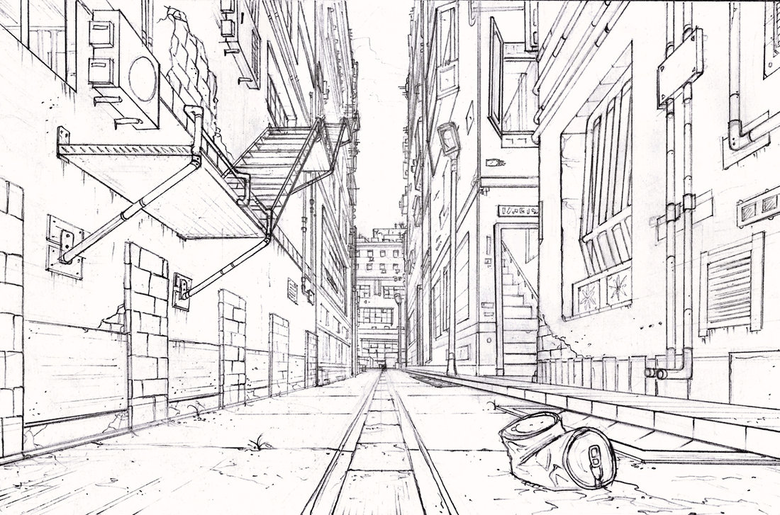
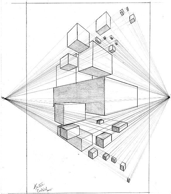
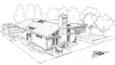
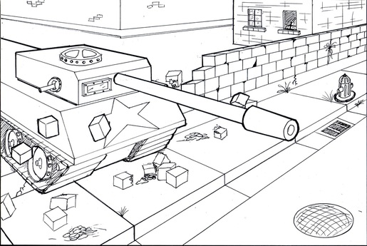
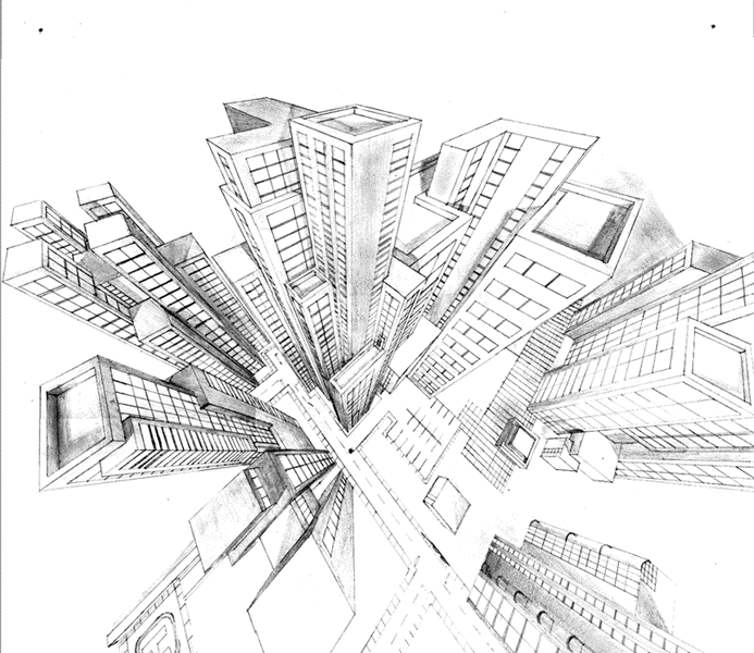
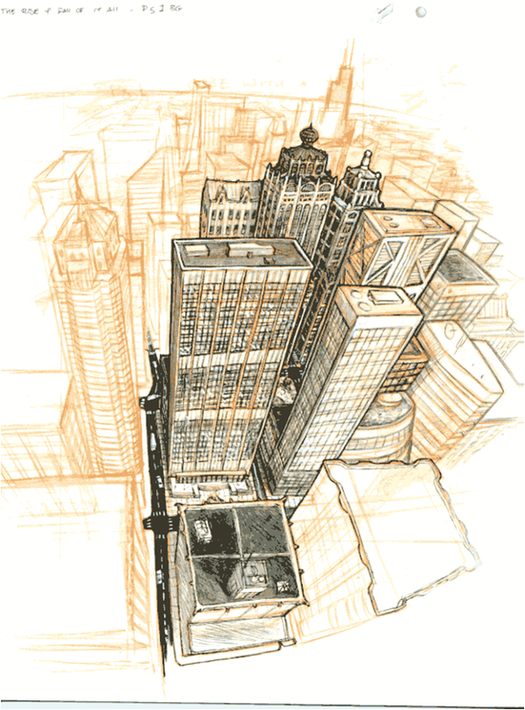
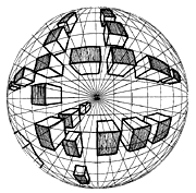
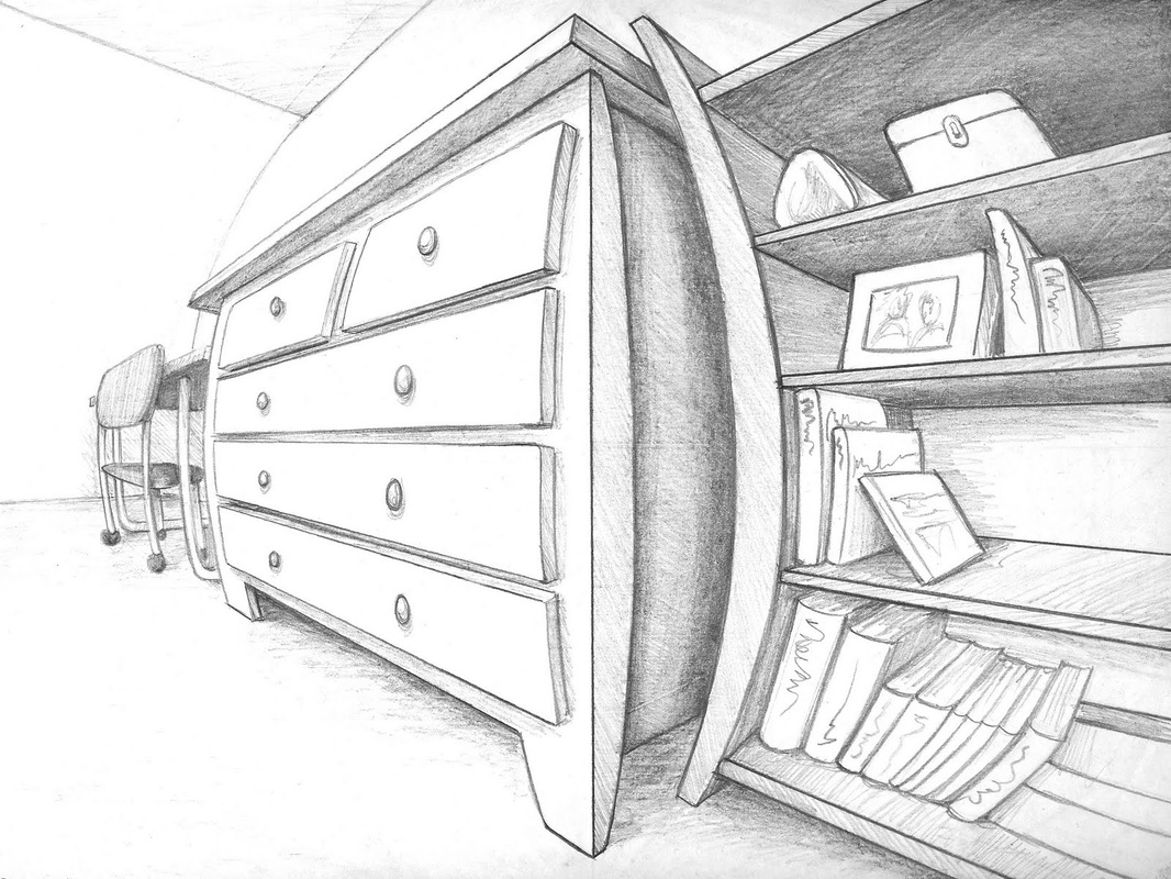
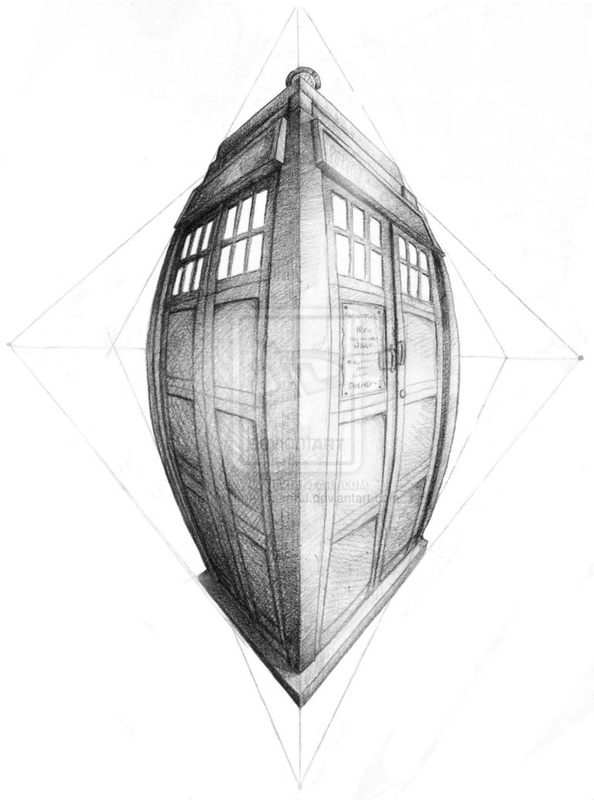
Perspective
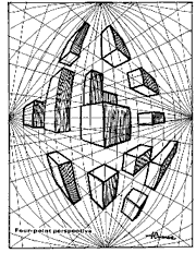
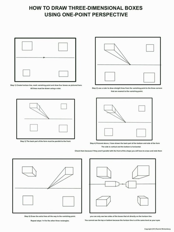
One point, two point, three point, four
point, and five
One point, two, and three are all flat in terms of a flat horizon. Once you leave three point and move to four point the plain becomes semi spherical....think phish eye for four point and actual sphere for five point.
One point


Two point
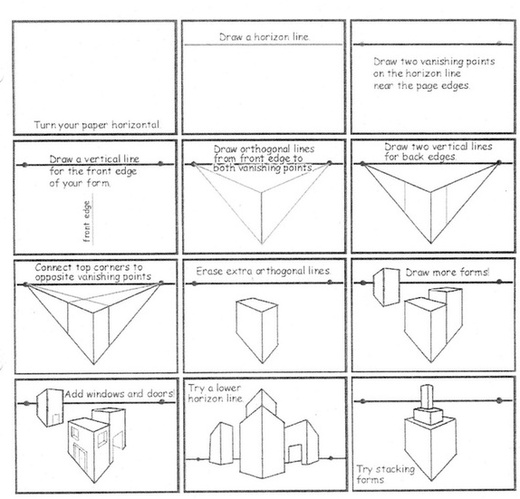


Three point
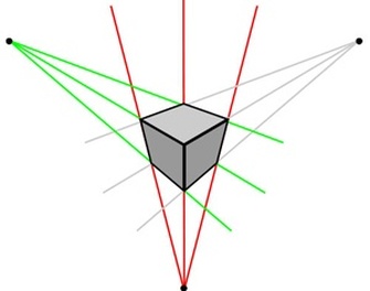
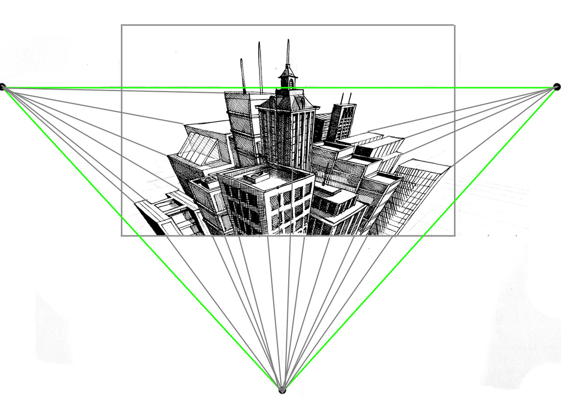


Four point


2/29/2016
Today....sorry Im not there.
Ok so sorry that i am not able to be there today, my son is not feeling well so hopefully he gets better and I can be back tomorrow. In the meantime, you all need to keep working on the current assignment. Make sure that you have completed the Pen and ink value scales (Stippling, Hatching, Cross-Hatching....in that order). Remember that the set up for these scales are exactly the same as the set up for the pencil value scales. Once you have completed the pen and ink value scales you then need to move on to creating the perspective cubes. One point, Two point, and three point are required......for students that feel that they have a good understanding of these three you can move on to trying 4 point and five point. There are students in each class that have attempted and completed both of these so if you struggle ask them for help.
Once you have completed the cubes then you need to move on to selecting what perspective you want to work with and what subject matter you want to work with. Many of you have already completed this step, sketch everything out so that you can reduce the amount of erasing in the final. The better your plan the more successful and less frustrating your final will be. You also need to remember that you will be inking the final so you don't need to go in depth with the shading at the start of the final. There is final paper in the top drawer of the cabinet where you turn in your work, if you run out there is more in the bottom of the supply cabinet that has big I written on it. The paper needs to be cut though at 12-1/4". The paper cutter is in the corner by the door.
If you have a question that CAN NOT wait until tomorrow use the contact page on THIS website to send me your questions and I will do my best to answer it as quickly as I can.....cant give you a promised response time but I will do my best to get back to you as quickly as I can.
3/2/2015
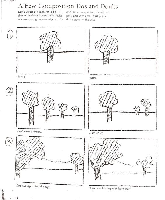
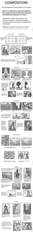
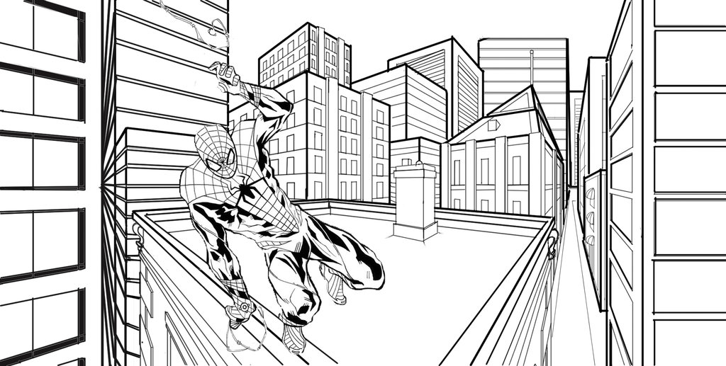
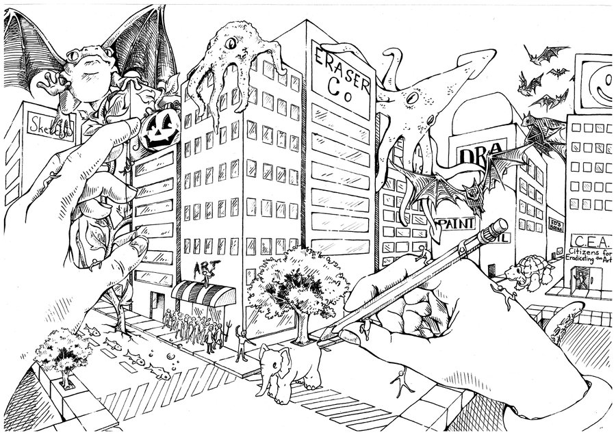
So here is the thing to learn today....that has nothing to do with art. If you ever end up with kids, you will learn that if one gets sick just as they get healthy the other will get sick. Soooo I'm again not going to be in class today. However what you can do is continue with the current project, remembering that you are first drawing out the perspective drawing in pencil (remember as lightly as you can so that when you erase it still is clean) then inking it using either stippling, hatching, or cross hatching. You can also combine the three different techniques into the same drawing, you don't have to use all one technique. Use them as you see fit. The way I look at the different techniques is that hatching can be used pretty much any time. If you look at the drawing on the board of breaking bad you can see that I used hatching primarily but there is also cross-hatching in places that I wanted to get a darker value. You have to decide which technique works best for you and apply it to your work. I am also going to attach a link here. This link deals with composition, how important it is, things to do, things not to do, and most likely a lot of things that you never even thought about doing or not doing.
(a little Donald Rumsfeld for you there...that would be a former secretary of defense. He once said " there are known knowns; there are things we know we know. We also know there are known unknowns; that is to say we know there are some things we do not know. But there are also unknown unknowns – the ones we don't know we don't know. And if one looks throughout the history of our country and other free countries, it is the latter category that tend to be the difficult ones.")
http://fox-orian.deviantart.com/art/Perspective-Composition-Pt-2-125042592
Ok so once you get to the page just click on the image and you will actually be able to see everything clearly. Some of the things that I want to call your attention to on the link are as follows.....
The opening portion of the link is Titled "finding a good framework" for some of you this may be helpful and for others this may be way over your head. To simplify it and what they are showing you if you look at the images that are just lines(no detail, so no pipes, buildings, people, cars.....you get it) you can see that they are just looking at how the positive and negative spaces are broken up within the work. THAT IS IT, don't over complicate it.
The next portion is titled "value and contrast". Here they are talking about what kind of value you want which is important. For YOU what you need to think about is do you want step value or graduated value? Do you want to use hatching, cross-hatching, or stippling to get it? And most importantly as we talked about and I ask all the time "Where is you light source?". Think about a light source and make sure that your shadows are all going away from your light source, it creates unity, movement, and contrast which in turn helps to create depth in your work.
The next portion I want you to look at currently is "scale" or proportion. Remember your sidewalk cant be two stories tall. Remember to constantly look at your work and compare everything in terms of size. Closer to you bigger and more detailed, further from you smaller and less detailed.
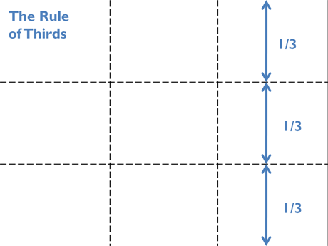
The "Rule of Thirds" REALLLLLLYYYYY important thing to look at here is that the image they are showing is almost perfectly aligned with the rule of thirds right? Right. However what you need to be careful of is that you can draw your horizon line so that its not breaking the page up but then place the tops of your buildings, or a skyline in the distance(could be mountains or anything for that matter) near the center of your page and end up splitting the page in half anyways. Also think about where you place tall buildings that may come up higher then the rest, be careful not so split your image in half vertically either with something that runs up and down(that for those of you that have forgotten....would be vertically!) the page.
Under the portion titled "center of focus" I just want you to look at how they created a focal point simply by using the vanishing point as their light source. By doing this not only are all the shadows remaining consistent, they also have all their lines going there which creates movement. It also in this image is creating a HUGE AMOUNT of contrast which reinforces the depth, and movement within the image. In that image you can almost not help but look at the focal point!
Ok and lastly....and most likely one of the most important. You can do all the rest of this correctly but if you mess this part up your composition will end up being kind of "ehhh". You know what I mean by that, when someone looks at your work and makes this face.
You don't want anyone to make that face when they look at your work and you say "what do you think?" The section titled "Layer your Composition" shows you a couple different versions of the same image. Pay attention to how in the one there is that bar on the right side of the image that is right up as if it was directly next to you in the image. Also look at the level of detail inside the train and the different passengers. One is talking on the phone, another is looking at the focal point creating emphasis and movement. Look at the level of contrast between outside the train and the inside of the train, it creates that real dark shadow and makes the main character (the focal point) stand out. Also look at the background, the artist here created a setting. Though it isn't much it helps the viewer to really feel like the character is somewhere specific, not just there. If you look the image right bellow it you can see how the majority of what I talked about is no longer present and the same image for the most part is lacking in so many ways. It just feels almost empty and lacking any kind of tension or importance what so ever. The first one feels like this is a big moment, maybe even a pivotal event in this persons life, a new beginning. In the second one......its just a person getting off a train that for some reason has so much stuff with that that they cant just carry it.....so they instead got a bag with wheels.....and that's pretty much it. No pivotal moment, no importance, no arriving somewhere......noda, nothing, zip, zilch. It gives you that Ehhhhhh face again.
Ok so I know that was a lot but I hope it helps. If you have questions I hope you know what to do.....use the contact page.
Ok so I know that was a lot but I hope it helps. If you have questions I hope you know what to do.....use the contact page.
Color Theory
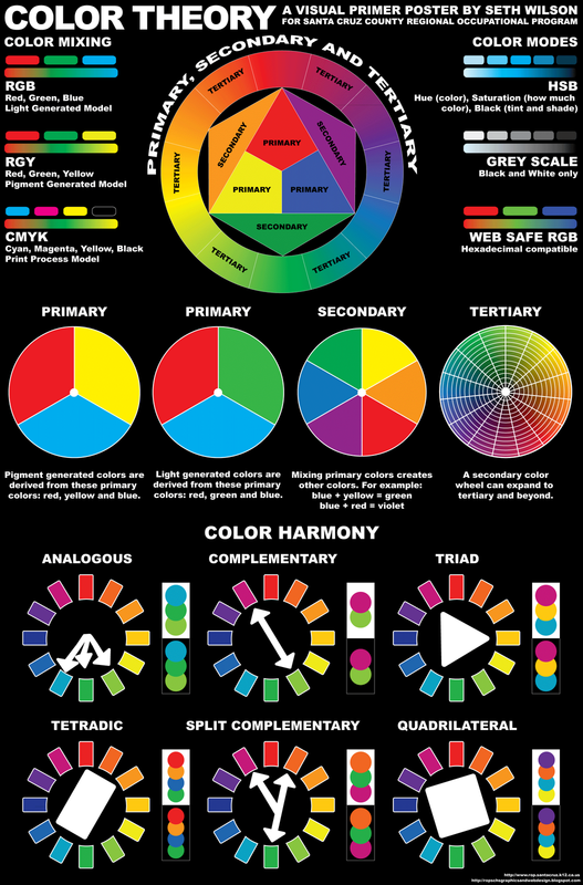
Here is the vocab for color theory.
- Saturation = is the purity, vividness or intensity of a color.
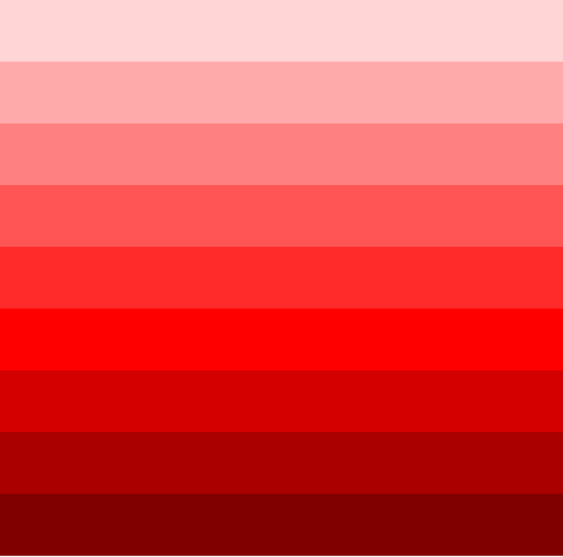
- Value = is a variation in the dark and light of color made by adding black and white to the color.
- Hue = the attribute of a color by virtue of which it is discernible as red, green, etc., and which is dependent on its dominant wavelength, and independent of intensity or lightness.
Color harmonies are different color combinations that have been identified as being pleasing to the human eye, these are often times referred to as color schemes as well as harmonies.
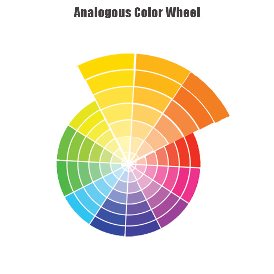
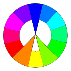
- Analogous = are colors that are next to each other on the color wheel and are closely related, such as yellow, yellow-orange, orange-yellow, and orange.
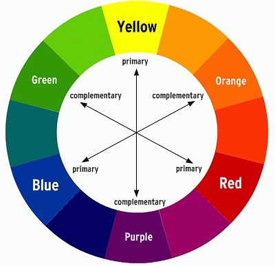
- Complimentary = are two colors that are directly opposite each other on the color wheel, meaning they are in extreme contrast with each other.
- Split Complimentary = colors directly across from each other on the color wheel, except in this case it is a color that is combined with hues on either side of its complement.
- Monochromatic = is one color that is modified by changing the values and saturation of the hue by additions of black and white.
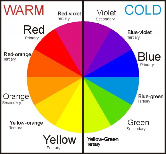
- Warm = Red, orange, and yellow
- Cool = Blue, green, and purple
- Neutral = Black, White, Grey, Brown
- Tint = is a variation in the dark and light of color made by adding white to the color.
- Shade = is a variation in the dark and light of color made by adding black to the color.

Corporate use
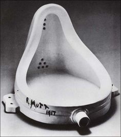
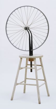
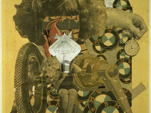
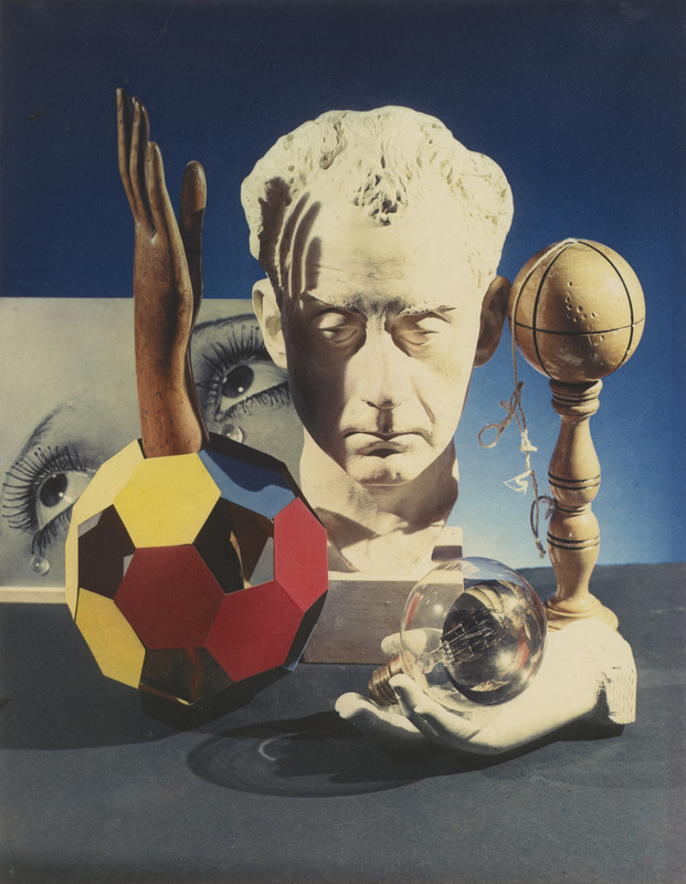
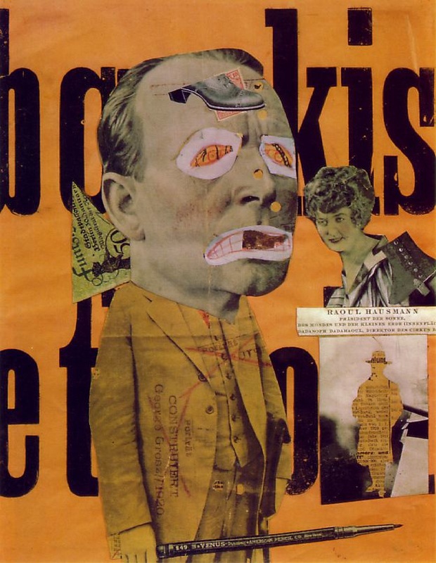
Dadaism
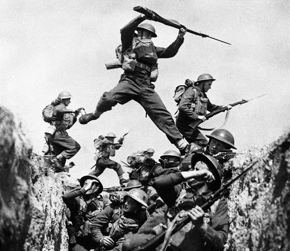
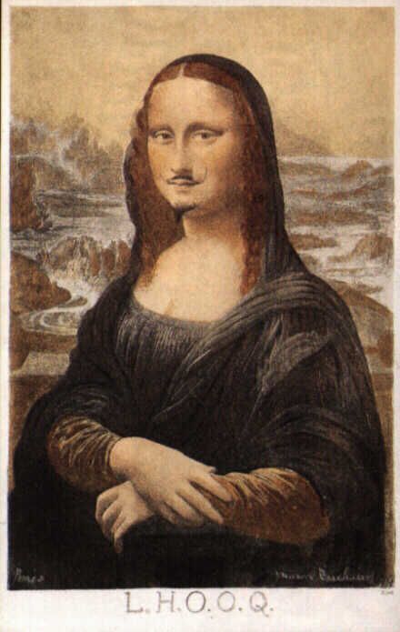
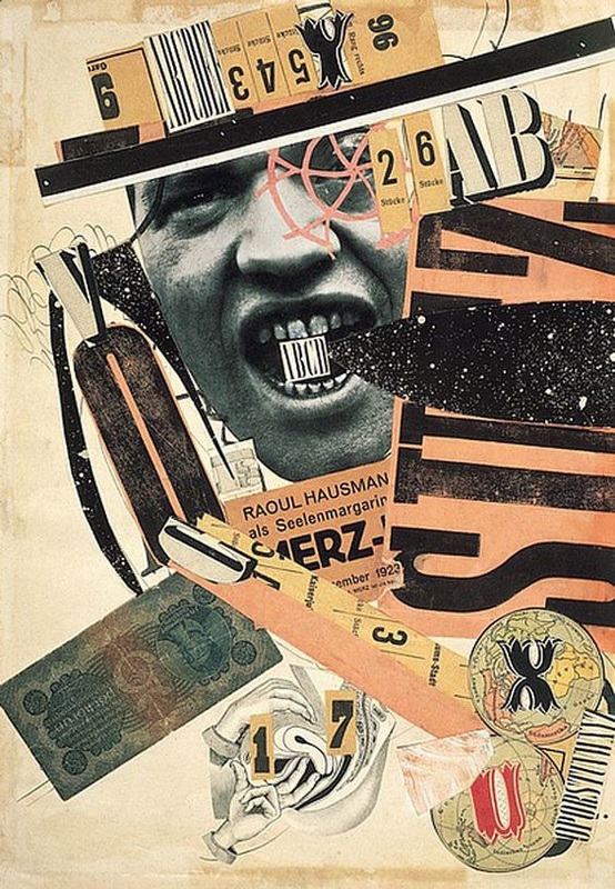
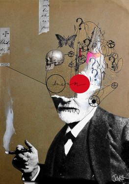
Dada was an artistic and literary movement that began in 1916 in Zurich, Switzerland. It arose as a reaction to World War I, and the nationalism, and rationalism, which many thought had brought war about. Influenced by ideas and innovations from several early avant-gardes -Cubism, Futurism, Constructivism, and Expressionism - its output was wildly diverse, ranging from performance art to poetry, photography, sculpture, painting and collage. Dada's aesthetic, marked by its mockery of materialistic and nationalistic attitudes, proved a powerful influence on artists in many cities, including Berlin, Hanover, Paris, New York and Cologne, all of which generated their own groups. The movement is believed to have dissipated with the arrival of Surrealist in France.
Key figures
Key figures
- Francis Picabia
- Marcel Duchamp
- Man Ray
- Andre' Breton
- Hans Arp
- Hugo Ball
- Hana Hoch
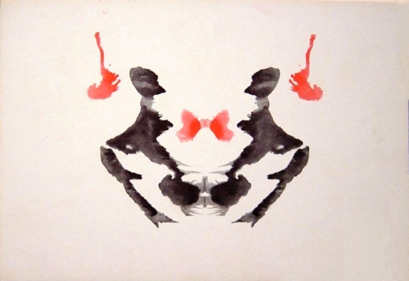
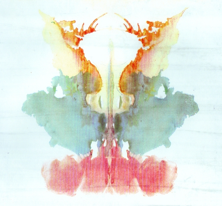
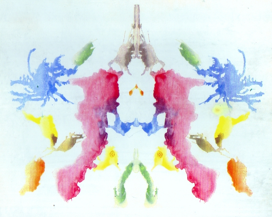
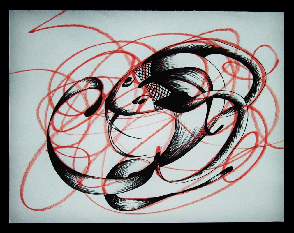
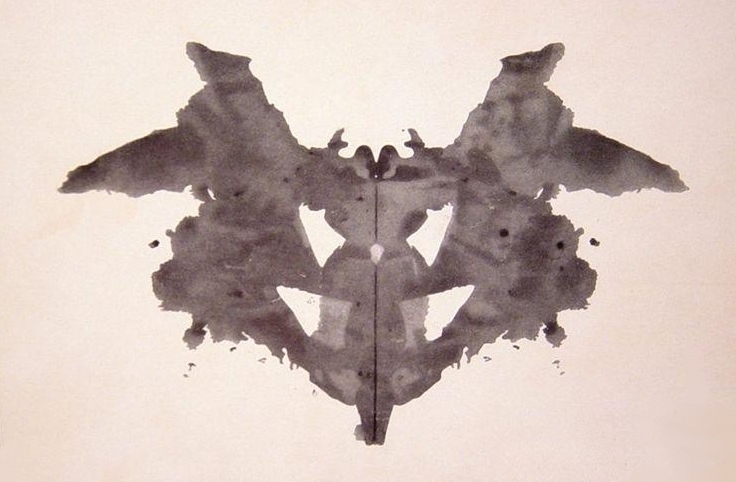
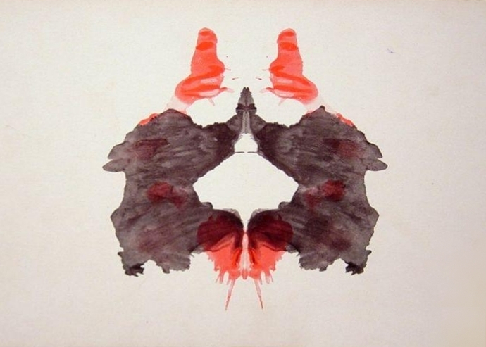
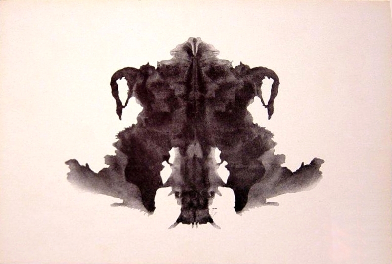
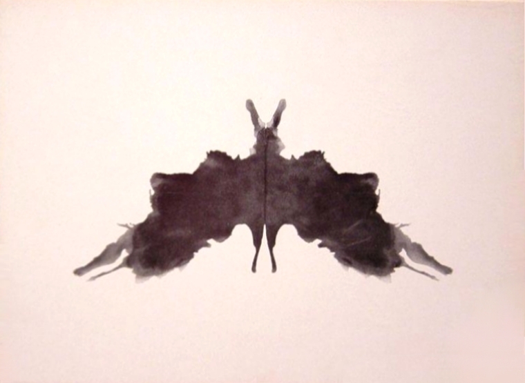
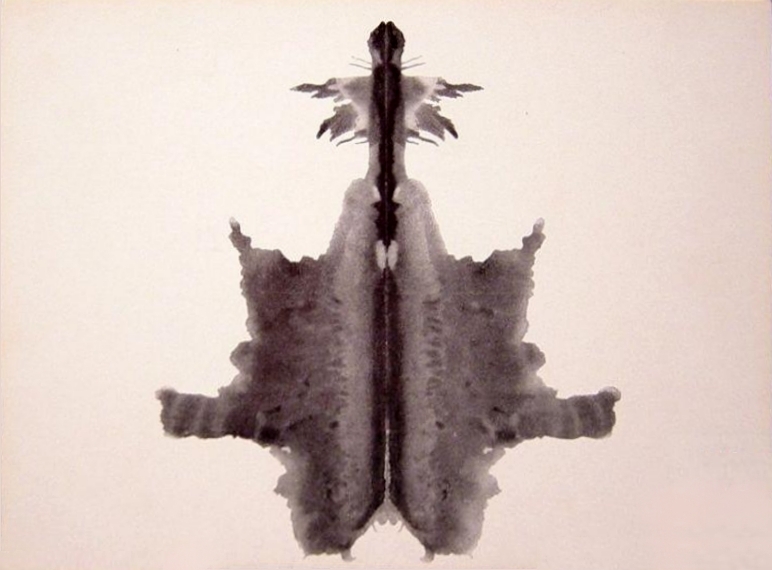
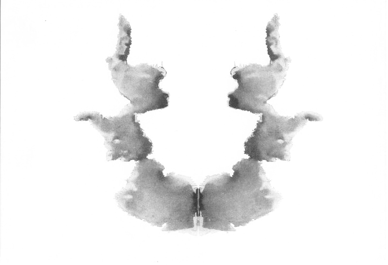
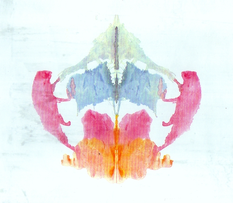
Ink Blot.....or Rorschach test


Self portraits
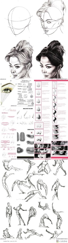
Studies
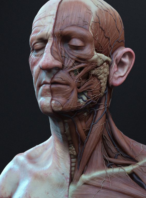
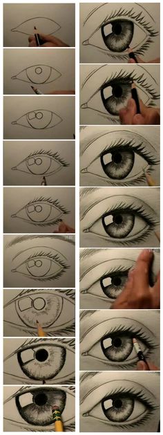
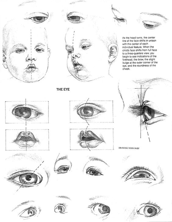
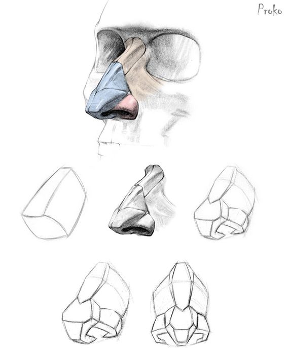
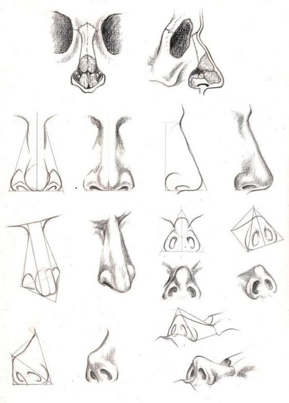
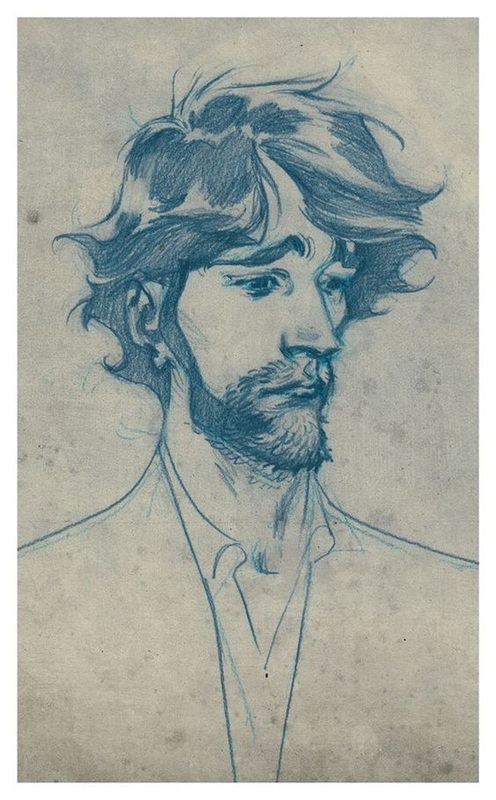
Before we can start the actual self portrait we need to start off with studies of the face and a general understanding of the facial structure....IE the bone structure. Remember the difference between a sketch and a study is that the sketch is quick, general and often times lack depth of value and detail. However the study focuses on just that, it also zooms into a subject and has an overall disregard for the overall composition.
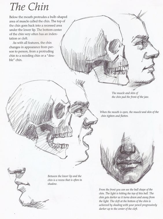
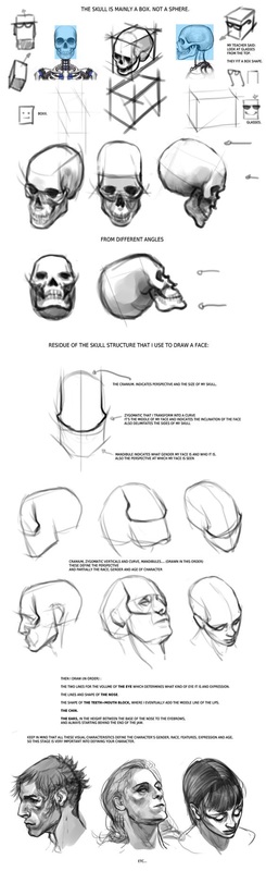
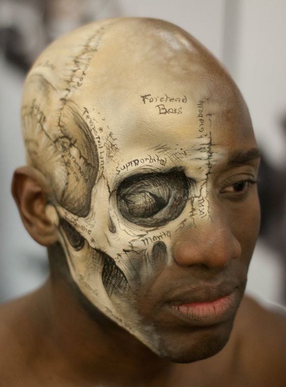
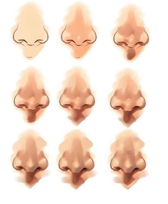
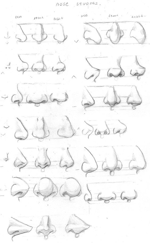
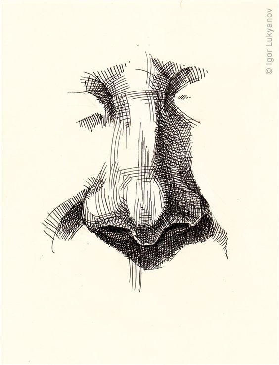
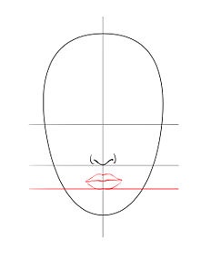
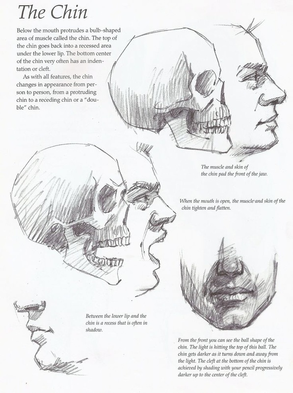
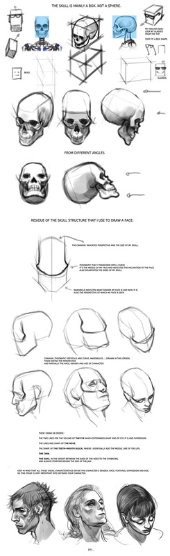
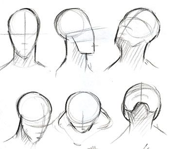
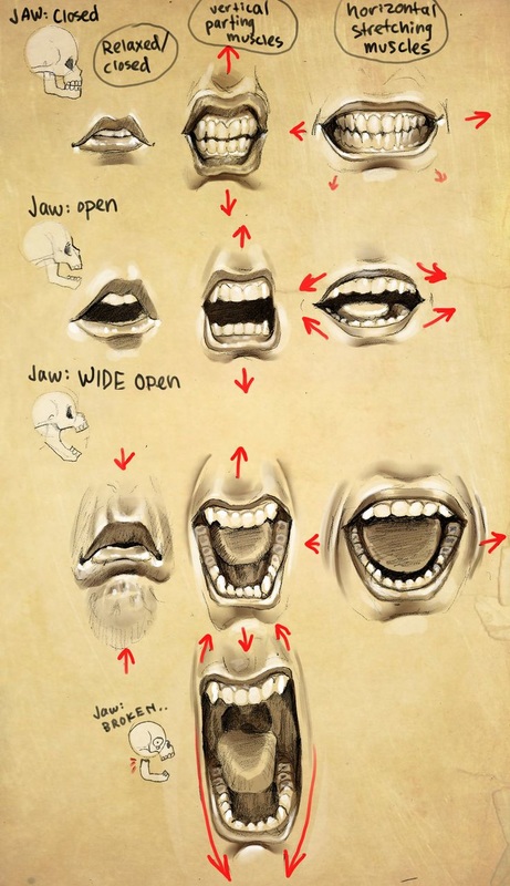
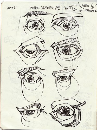
Facial Structure

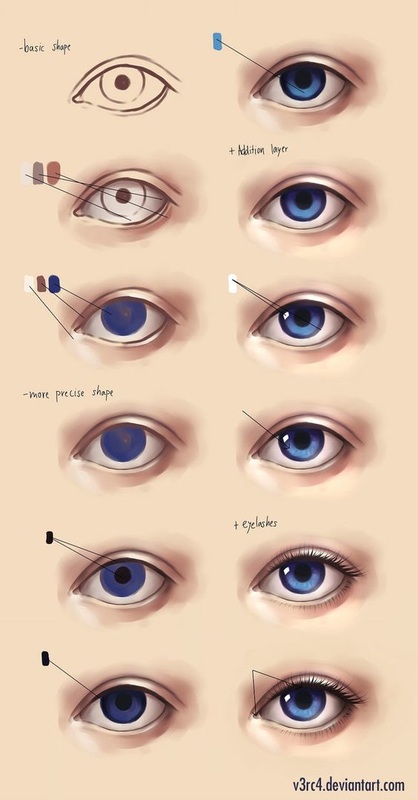
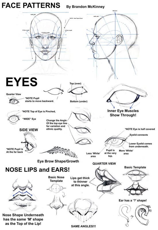
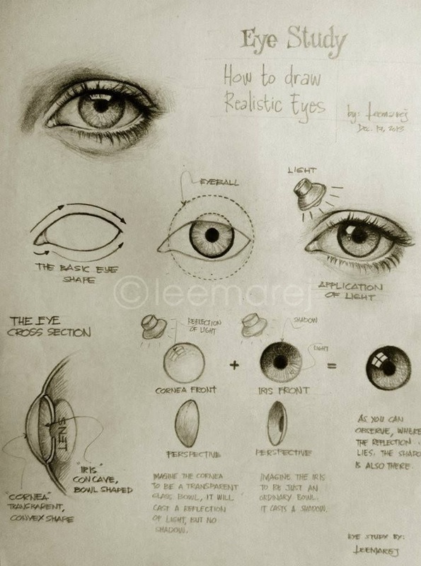
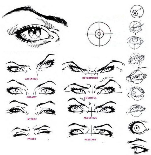
Eyes
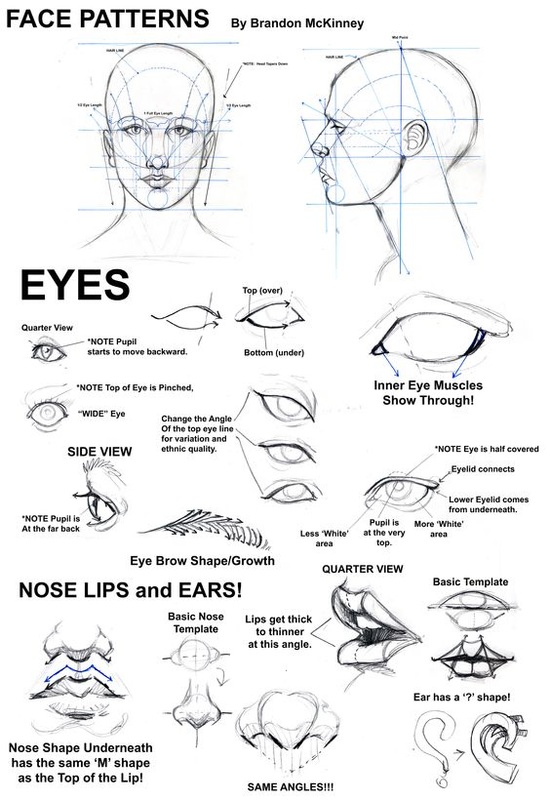


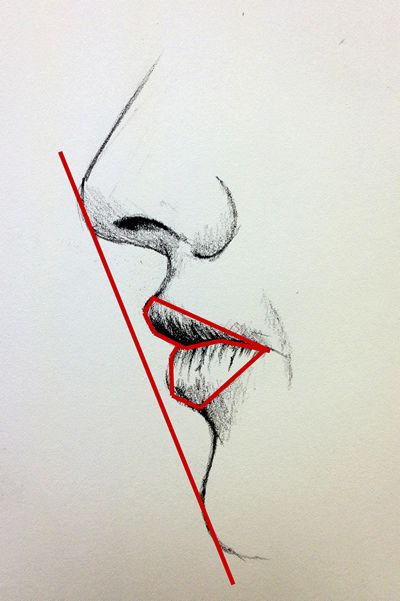
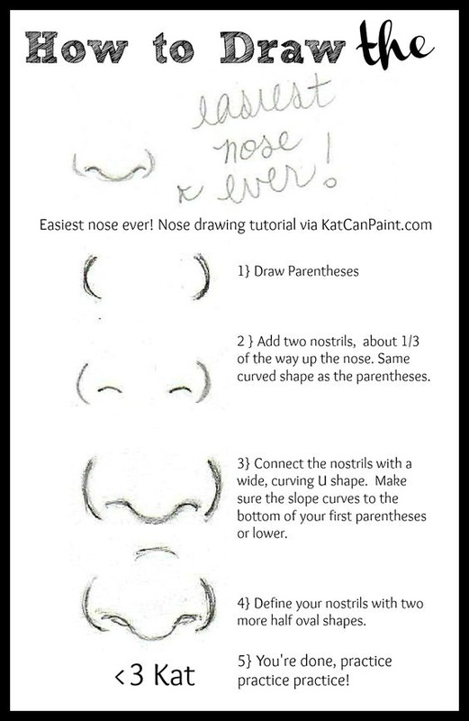
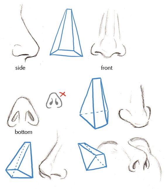
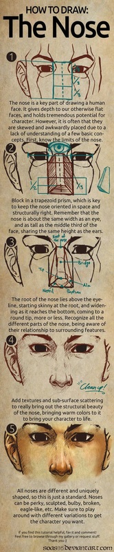
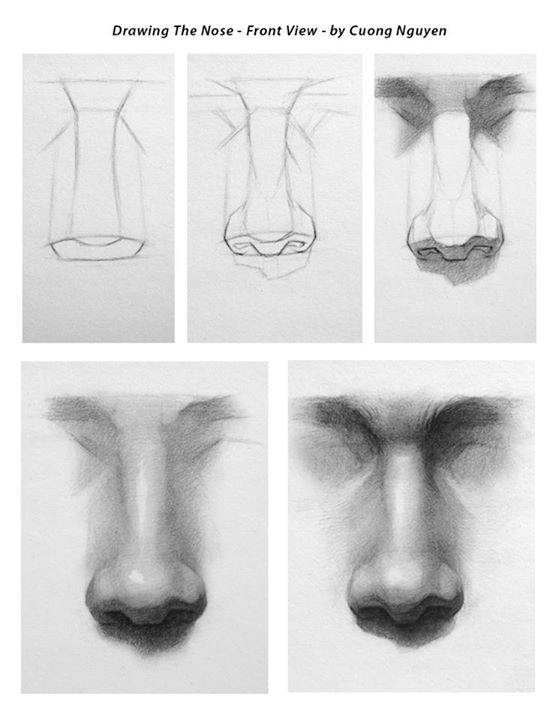
Nose
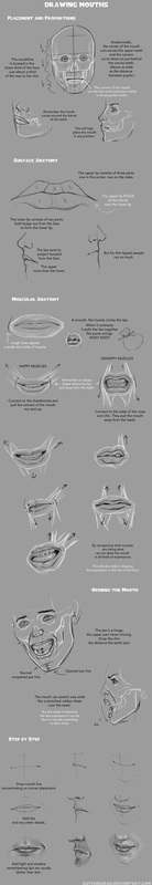
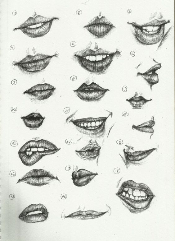
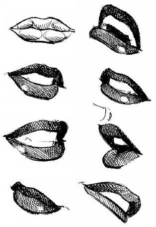
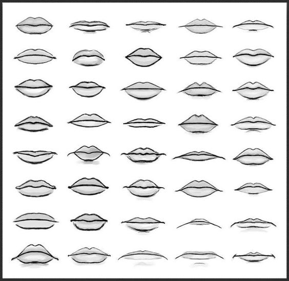
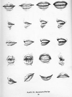
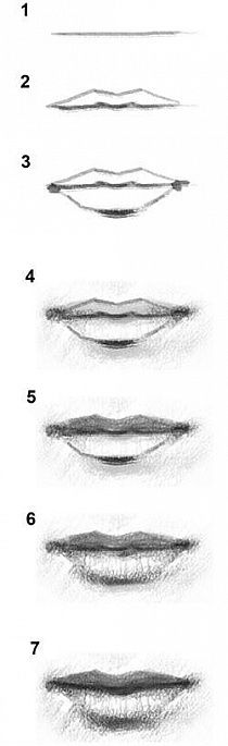
Mouth

Hair
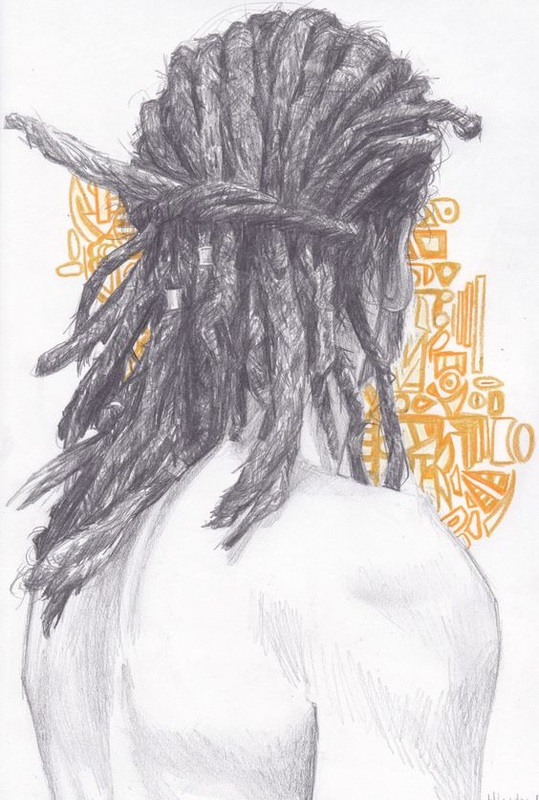
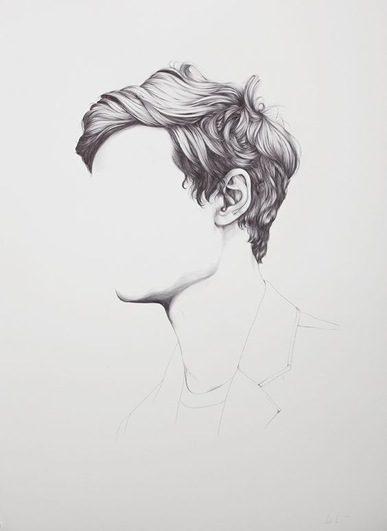
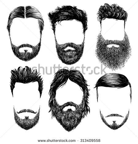
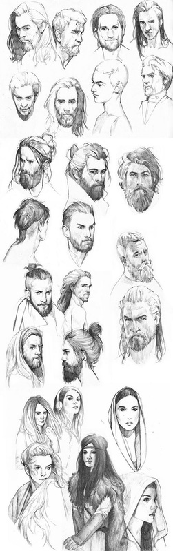
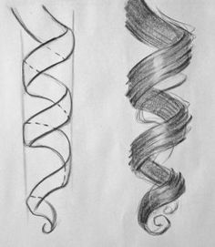
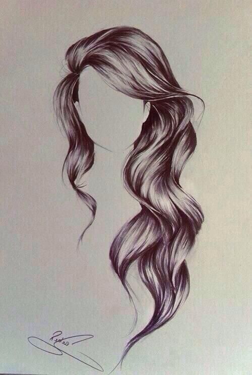
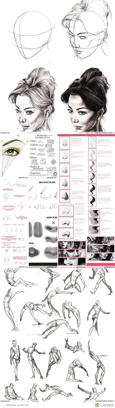
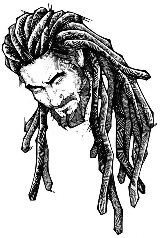
Examples
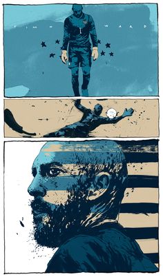
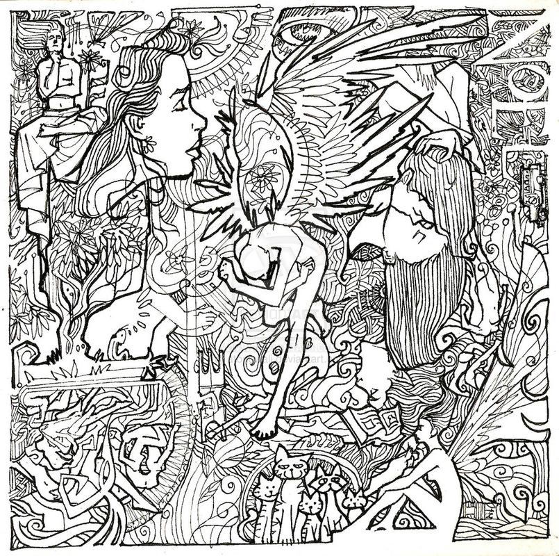
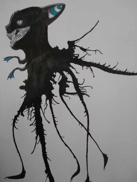
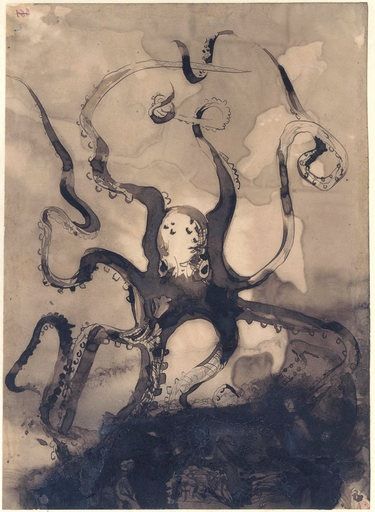
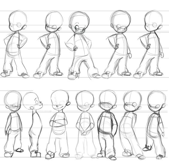
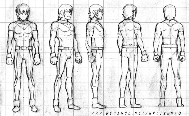
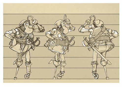
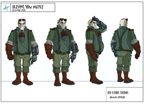
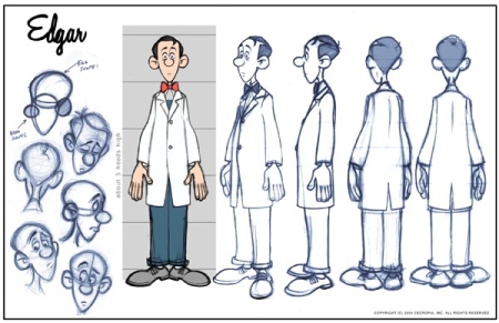
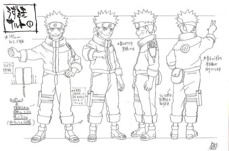
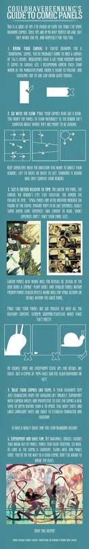
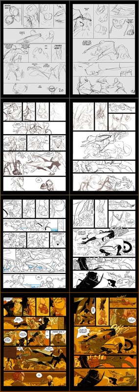
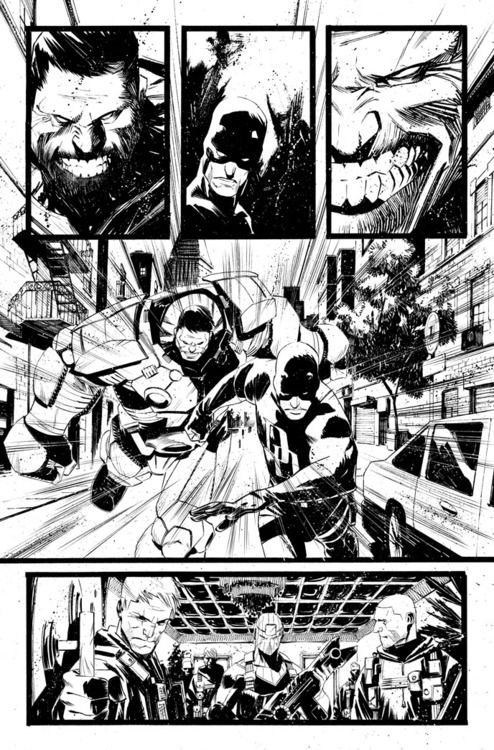
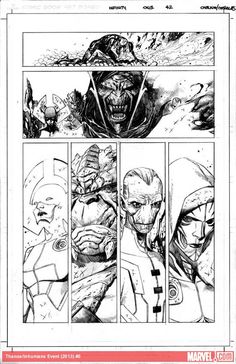
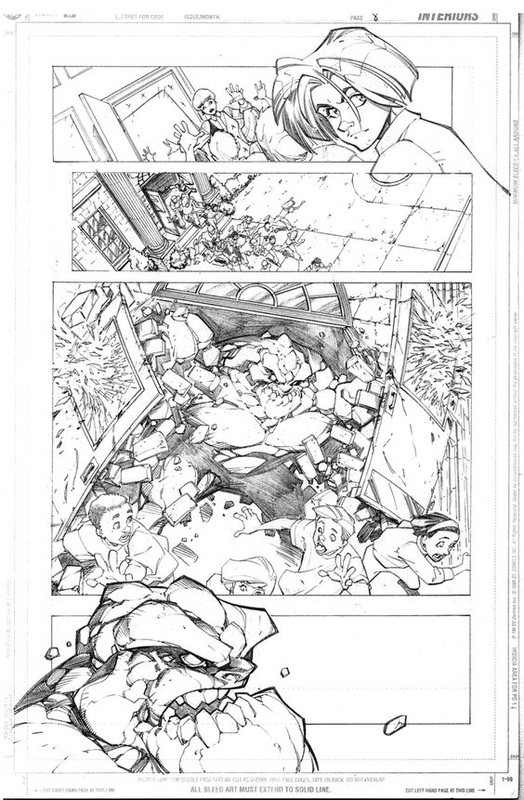
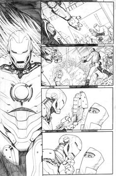
Character design
Step one is to start out sketching ideas for your character. Try different poses, different clothing, hair styles.......simply play around with whatever idea you have or try out a couple different ideas.
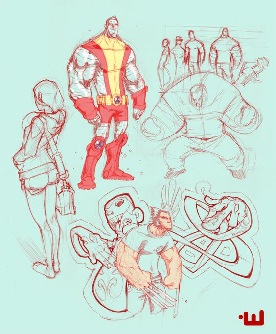
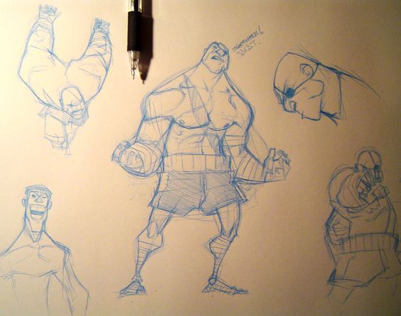
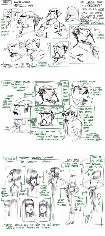
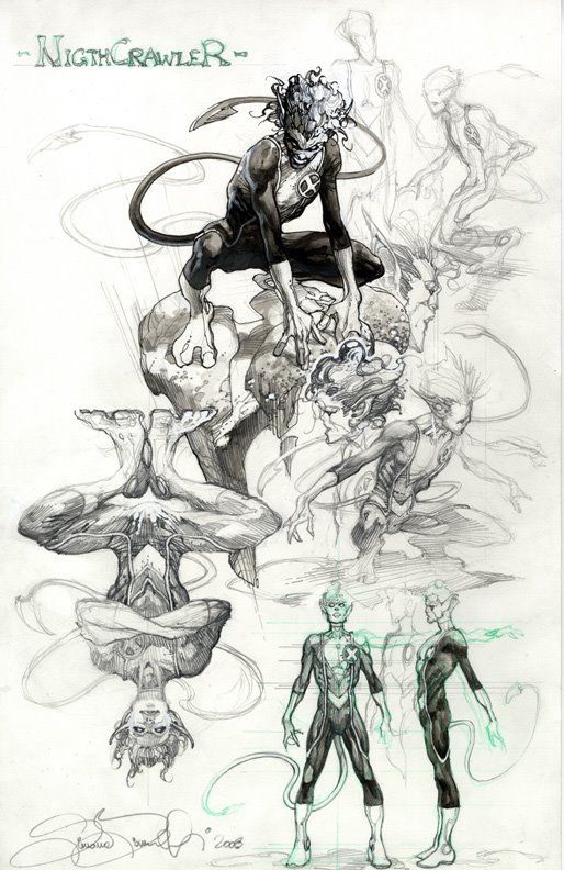
Next you want to take whatever character you have chosen and do a character design board. This will allow you to get a good idea of what your character is going to look like from a variety of angles.
Once you know your character/characters you can start mapping out what your story will look like. In other words what scenes are you going to need to be able to tell the story you want to tell? How are you going to show the viewer what is going on, where it is going on, why it is going on......simply think about answering the "Who, what, when, where, and why?" This step is all about content and story. At this point don't worry about things like movement, balance, contrast, or emphasis. If your story doesn't make sense then all those things wont matter.
Page layout is possible as important as any other aspect of this project. Here is where your balance, movement, rythm, emphasis, contrast, depth, variety.......all come into play. If you do a good job developing your character and selecting your scenes but not a good job with the layout of each cell and the overall flow of the project you are most likely going to be unsuccessful.
First Semester
Art 1
8/25/2015
The first project functions as a tool for students to keep their work organized throughout the semester as well as a way for myself to evaluate where each students basic skills are. Some of the skills/knowledge base that I am looking at are the students ability to create a composition within a two dimensional picture plain, ability to use and manipulate value, understanding and ability to create movement and balance.
The last day to work on these projects in class will be this coming Friday, 8/28.
The NC Art Essential standards that will be covered throughout this project are
- B.V.1.1 Use art vocabulary when discussing art and artistic styles.
- B.V.1.2 Apply the Elements of Art and Principles of Design to create art.
- B.V.1.4 Recognize how Elements of Art and Principles of Design are used in art.
Students through this lesson will be introduced to both the elements of art and the principles of design. Today (8/25), students received the definitions for the 7 elements of art. Those elements are Shape & Form, Space, Texture, Line, Color, and Value. Below are the notes from today.
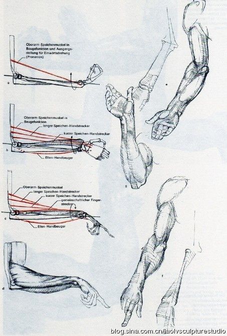
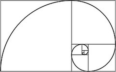
Rule of 3rd's and the Golden mean (Fibonacci Sequence)Students also learned about the importance of use of the rule of thirds. The concept behind the rule of thirds is to divide the picture plain into 9 equal portions. This helps to keep images balanced and visually pleasing. The rules of thirds has many times been linked in ways with what is called the Golden Mean, Golden Spiral, Golden ratio, or finally the Fibonacci Sequence. The Golden Mean is a mathematical ratio that refers to how one measurement relates to another. The ratio is 1:1.618. If you divide each smaller window gain with the same ration and join the corners you end up with a logarithmic spiral. The spiral is a motif found frequently throughout nature in shells, horns, flowers, pine-cones, hurricanes, tornadoes, planets, constellations, and even galaxies. It also breaks down the human body almost perfectly, the arm, the bones in the human hand, even our teeth fall into this mathematical equation.
|


|
Elements of Art
1. Shape = An element of art, an enclosed space defined by other art elements such as line, color, and texture.
2. Form = An element of art that appears three-dimensional and encloses volume such as a cube, sphere, pyramid or cylinder
3. Space = An element of art that indicates areas between, around, above, below, or within a composition, there are two kinds of space positive and negative.
4. Texture = is the surface quality of an artwork usually perceived through the sense of touch; however texture can also be implied, perceived visually though not felt through touch.
5. Line = An Element of art that is used to define space, contours and outlines or suggested mass and volume.
6. Color = An element of art with three properties: hue, value, and intensity. Also the character of surfaces created by the response of vision to wavelengths of reflected light
7. Value = an element of art concerned with the degree of lightness or darkness
2. Form = An element of art that appears three-dimensional and encloses volume such as a cube, sphere, pyramid or cylinder
3. Space = An element of art that indicates areas between, around, above, below, or within a composition, there are two kinds of space positive and negative.
4. Texture = is the surface quality of an artwork usually perceived through the sense of touch; however texture can also be implied, perceived visually though not felt through touch.
5. Line = An Element of art that is used to define space, contours and outlines or suggested mass and volume.
6. Color = An element of art with three properties: hue, value, and intensity. Also the character of surfaces created by the response of vision to wavelengths of reflected light
7. Value = an element of art concerned with the degree of lightness or darkness
8/26/2015
Principles of Design
1. Unity = A principle of design related to the sense of wholeness that results from the successful combinations of the elements of art.
2. Variety = The use of several elements of design to hold the viewer’s attention and to guide the viewer’s eye through and around the work of art.
3. Emphasis = A principle of design in which one element, or a combination of elements, create more attention than anything else in a composition. The dominant element is usually a focal point in a composition and contributes to unity by suggesting that other elements are subordinate to it.
4. Balance = The equal distribution of positive and negative space throughout a work of art so that no portion of the work visually weighs more.
5. Proportion = A principle of art reflecting the size relationship of parts to one another and to a whole.
6. Pattern = The repetition of elements or combinations of elements in a recognizable organization, also could be the repeating of an object or symbol all over the work of art.
7. Rhythm = Is created when one or more elements of design are used repeatedly to create a feeling of organized movement. Rhythm creates a mood like music or dancing. To keep rhythm exciting and active, variety is essential.
8. Movement = The path the viewer’s eye takes through the work of art, often to focal areas. Such movement can be directed along lines, edges, shape, and color within the work of art.
9. Repetition = The repetition of elements of art to create unity within the work of art (line, color, shape, form).
2. Variety = The use of several elements of design to hold the viewer’s attention and to guide the viewer’s eye through and around the work of art.
3. Emphasis = A principle of design in which one element, or a combination of elements, create more attention than anything else in a composition. The dominant element is usually a focal point in a composition and contributes to unity by suggesting that other elements are subordinate to it.
4. Balance = The equal distribution of positive and negative space throughout a work of art so that no portion of the work visually weighs more.
5. Proportion = A principle of art reflecting the size relationship of parts to one another and to a whole.
6. Pattern = The repetition of elements or combinations of elements in a recognizable organization, also could be the repeating of an object or symbol all over the work of art.
7. Rhythm = Is created when one or more elements of design are used repeatedly to create a feeling of organized movement. Rhythm creates a mood like music or dancing. To keep rhythm exciting and active, variety is essential.
8. Movement = The path the viewer’s eye takes through the work of art, often to focal areas. Such movement can be directed along lines, edges, shape, and color within the work of art.
9. Repetition = The repetition of elements of art to create unity within the work of art (line, color, shape, form).
8/27/15
Value scales
In class we have been working on creating three different value scales to this point. The first was the gradiated scale, this is what we see in real life. In this scale values fade smoothly from dark to light without any clear line of change being present. The second was step value which is shown at the top of the image to the left. In this scale values are flat and the change from one step to the next is great enough to create a line of change.

The third scale is cross-hatching which is a technique used to create value.
9/1/15
Forms
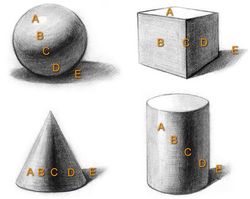
Currently we are moving from the creation of the value scales to the application of the value scales and types of value to forms. Each student will apply gradiated, step, and cross-hatching to each of the forms shown above. I also placed the shadows example to help you see how the shadows are formed and the overall impact of the light source location on the shadows.

|
|
I also wanted you to be able to see what I was talking about during the demo when I mentioned that the surface/texture/material that the form was made of would have a huge impact on the way light affected the surface and the placement of value. The example of the spheres here to right is a great example that shows exactly what I was talking about. This is more advanced then what we are currently working on but.....we will get there.
All work on value scales in class should be completed by tomorrow!
Types of Compositions
1.) Formal composition: Art piece stressing symmetrical balance as its core compositional idea.
2.) Informal Composition; Art piece stressing asymmetrical balance as its core compositional idea.
3.) Static composition: Art that stresses horizontal and vertical accents, closure at the edges of the artwork and subdued color and value.
4.) Dynamic composition: Art that stresses intersecting diagonals, elements extending off the picture plane, vigorous contrast of light and color, and a sense of movement, activity, and conflict.
5.) Closed composition: art piece that has all elements contained by the picture plane.
6.) Open Composition: Art piece that has elements extending outside the picture plane.
9/9/2015 - 9/10/2015
Today we went over a few different topics all relating to the creation of your current value based project. Remembering that 25% of this grade will come from if you have shown the ability to create a decent range of value using gradiated, step, and crosshatching. THAT MEANS MORE THAN 1 OR 2 VALUES. The two subjects covered today, one new and one reviewed where as follows.
Sketch V.S. Thumbnail V.S. Study
|
A sketch by definition is a rough or unfinished drawing created to help create the artist in the creation of a final. The sketch focuses on distribution of space, proportions, and basic block value.
A study is a drawing done in preperation for a finished piece of work. Often the study zooms in on certain selections of a larger object or subject in order to better understand the problems that exist such as light, color, texture, form, etc. Studies can be traced as far back as the Italian renaissance during the 14th century.
A Thumbnail is a very small, quick sketch that focuses almost completely on composition. Though there is no specific way to or not to do a thumbnail they are typically devoid of detail. Thumbnails also often times lack value all together, again though this is something that is up to the artist. The key is that they are quick, and help the artist work through the numerous options available for setting up a composition.
|
9/14/15
Art/Design Synectics
The term synectics is from the Greek word synectikos, which means “bringing forth together,” or “brining different things into unified connection.”
Since creativity involves the coordination of things into new structures, every creative thought or action draws on synectic thinking. For thousands of years, artists and thinkers have been haunted by questions of creativity. A glimpse into this intriguing real of though is provided by statements such as the following:
“Creative behavior occurs in the process of becoming aware of problems, deficiencies, gaps in knowledge, missing elements, disharmonies; bringing together in new relationships available information; identifying the missing elements; searching for solution, making guesses, or formulating hypotheses.”
- E. Paul Torrance
“A man becomes creative, whether he in an artist or a scientist, when he finds a new unity in the variety of nature. He does so by finding a likeness between things which were not though alike before.”
- Jacob Bronowksi
In summary, Synectic thinking is the process of discovering the links that unite seemingly disconnected elements. It is a way of mentally taking things apart and putting them together to furnish new insight for the solution of problems in both art and industry.
9/17/15 - 9/22/15
Synectic Trigger mechanisms
- Subtract = Simplify, omit, remove certain parts or elements. Take something away from your subject. Compress it, make it smaller. Think: What can be eliminated, reduced, or disposed of? What rules can you break? How can you simplify, abstract, stylize or abbreviate?
- Repeat = Repeat a shape, color, form, image or idea. Reiterate, echo, restate or duplicate your reference subject in some way. THINK: How can you control the factors of occurrence, repercussion, sequence and progression?
- Combine = Bring things together. Connect, arrogance, link, unify, mix, merge, wed, rearrange. Combine ideas, materials and techniques. Bring together dissimilar things to produce synergistic integration's. THINK: What else can you connect to your subject? What kind of connections can you make from different sensory modes, frames of reference or subject disciplines?
- Add = Extend, expand, or otherwise develop your reference subject. Augment it, supplement, advance or annex it. Magnify it: make it bigger. THINK: What else can be added to your idea, image, object, or material?
- Transfer = Move your subject into a new situation, environment or context. Adapt transpose, relocate, dislocate. Adapt the subject to a new and different frame of reference. Move the subject out of its normal environment; transpose it to a different historical, social, geographical or political setting or time. Look at it from a different point of view.
- Empathize = Sympathize. Relate to your subject; put yourself in its shoes. If the subject is inorganic or inanimate, think of it as having human qualities. how can you relate to it emotionally or subjectively?
- Animate = Mobilize visual and psychological tension in a painting or design. Control the pictorial movements and forces in the picture. Apply factors of repetition, progression, serialization or narration. Bring life to inanimate subjects by thinking of them as having human qualities.
- Superimpose = Overlap, place over, cover, overlay: Superimpose dissimilar images or ideas. Overlay elements to produce new images, ideas or meanings. Superimpose different elements from different perspectives, disciplines or time periods on your subject. Combine sensory perceptions (sound/color, etc). Think: What elemtns or images from different frames of reference can be combined in a single view? Notice, for example, how cubist painters superimposed several views of a single object to show many different movements in time simultaneously.
- Disguise = Camouflage, conceal, deceive or encrypt: How can you hide, mask or implant your subject into another frame of reference? In nature, for example, chameleons, moths and certain other species conceal themselves by mimicry: Their figure imitates the ground. Think: Subliminal imagery can create a latent image that will communicate subconsciously, below the threshold of conscious awareness, this is an extreme example of disguised imagery.
- Contradict = contradict the subjects original function. Contravene, deny, reverse: many great works of art are, in fact, visual and intellectual contradictions. They may contain opposite, antipodal, antithetical or converse elements which are integrated in their aesthetic and structural form. They may also contradict laws of nature such as gravity, time, etc. THINK: How can you visualize your subject in connection with the reversal of laws of nature, gravity, magnetic fields, growth cylcles, proportions; mechanical and human functions, procedures, games, rituals, or social conventions?
- Parody = Ridicule, mimic, mock, burlesque or caricature: Make fun of your subject, "roast" it, lampoon it. Transform it into a visual joke or pun. Exploit the humor factor, make zany, ludicrous or comic reference. Create a visual oxymoron or conundrum.
- Change Scale = Make your subject bigger or smaller. Change proportion, relative size, ratio, dimensions or normal graduated series.
- Substitute = Exchange, switch or replace: THINK: What other idea, image, material or ingredient can you substitute for all or part of you subject?
- Isolate = Separate, set apart, crop, detach: Use only a part of your subject. in composing a picture, use a viewfinder to crop the image or visual field selectively. "crop" your ideas, too, with a "mental" viewfinder. THINK: What element can yo detach or focus on?
- Distort = Twist your subject out of its true shape. Proportion or meaning: THINK what kind of imagined or actual distortions can you effect? How can you misshape it? Can you maint5ain or produce a unique metaphoric and aesthetic quality when you misshape it?
- Prevaricate = Equivocate Fictionalize bend the truth, falsify, fantasize Although telling fibs is not considered acceptable social conduct it is the stuff that legends and myths are made of. THINK How can you use your subject as a theme to present information?
- Analogize = Compare Draw associations: Seek similarities between things that are different make comparisons of you subject to elements from different domains. What Logical and illogical associations can you make?
- Hybridize = Cross-fertilize we your subject with an improbable mate. Think: What would you get if you crossed a _____ with a _____? Organic/mechanical, use of color from and structure.
- Metamorphose = Transform, convert, Trans-mutate: Depict you subject in a state of change it can be a simple transformation (an object changing its color, for example. Think of the cocoon to butterfly types of transformations, aging, structural progressions, as well as radical and surreal metamorphosis such as Jekyll and Hyde.
- Symbolize = How can your subject be imbued with symbolic qualities. A visual symbol is a graphic device which stands for something other then what it is. Public symbols are cliches insofar as they are well-known and widely understood. While private symbols are cryptic and have special meaning only to their originator works of art are often integration's of both public and private symbols.
- Mythologize = Build a myth around your subject. In the sixties pop artist mythologized common objects like coca- cola, Campbell soup brillo pads, comic strip characters, movie start mass media images, hot rods, burgers……
- Fantasize= Use it to trigger surreal, preposterous, outlandish, outrageous, bizarre thoughts Topple mental and sensory expectations. What if automobiles where made of brick? What if night and day occurred simultaneously?
9/24/15
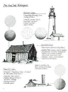
Pen and Ink Techniques
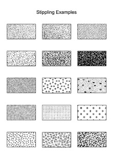
As a part of the Synectic Trigger mechanisms project students will also be integrating pen and ink techniques. One of these techniques we used during the first project and students should already be familiar with. The three most common techniques for pen and ink work are as follows, cross-hatching, hatching, and stippling. Of the three stippling is without a doubt the slowest and most complained about. however as students start to use it and become more familiar with stippling it also becomes the most used due to the amount of control that it gives students. Line weight is another technique that can be used to create value as well as depth within a ink drawing.

|
|

|
10/9/15
Finishing up Pen & Ink/Synectic Trigger Mechanisms
Tomorrow 10/9/15 we will be starting a new project. That means for all students that you will have Friday to finish up your work and if absolutely needed Monday. However as we are approaching the end of the nine weeks all students need to make sure that ALL work has been turned in for a grade. Every student needs to take the time to access their work and make sure they will be able to finish in time. If not students may need to start taking some work home to assure full completion.
With the closure of this project I would like each student to do a brief self assessment of their work in written form in their sketchbooks.
1.) What object did you pick, and what trigger mechanism/mechanisms did you pick and why? Are you happy with the selections that you made and if not why?
2.) Thinking about your composition, identify which kind of composition you used. Look back at the 6 different kinds of compositions and Identify yours as best you can. What elements and principles where used in your work that supports the kind of composition that you have?
3.) Lastly was this a successful final piece or not? Have you demonstrated contrast through the use of these inking techniques, and did you use the trigger mechanisms to your benefit to create a solid composition?
Grading Criteria for Pen & Ink/Synectic Trigger Mechanisms
1.) Synectic trigger mechanism usage, did you follow the directions and successfully implement one or more trigger mechanisms?
2.) Pen and Ink techniques, did you demonstrate the ability to use one or more inking techniques successfully?
3.) Value, with those techniques did you demonstrate a clear ability to create a wide range of value within your composition?
4.) neatness, is your paper free of pencil marks, smudges, stray lines, wrinkles, creases, folds, tares.......?
10/11/15
Color Theory
Here is the vocab for color theory.
Color harmonies are different color combinations that have been identified as being pleasing to the human eye, these are often times referred to as color schemes as well as harmonies.
- Saturation = is the purity, vividness or intensity of a color.
- Value = is a variation in the dark and light of color made by adding black and white to the color.
- Hue = the attribute of a color by virtue of which it is discernible as red, green, etc., and which is dependent on its dominant wavelength, and independent of intensity or lightness.
Color harmonies are different color combinations that have been identified as being pleasing to the human eye, these are often times referred to as color schemes as well as harmonies.
- Analogous = are colors that are next to each other on the color wheel and are closely related, such as yellow, yellow-orange, orange-yellow, and orange.
- Complimentary = are two colors that are directly opposite each other on the color wheel, meaning they are in extreme contrast with each other.
- Split Complimentary = colors directly across from each other on the color wheel, except in this case it is a color that is combined with hues on either side of its complement.
- Monochromatic = is one color that is modified by changing the values and saturation of the hue by additions of black and white.
- Warm = Red, orange, and yellow
- Cool = Blue, green, and purple
- Neutral = Black, White, Grey, Brown
- Tint = is a variation in the dark and light of color made by adding white to the color.
- Shade = is a variation in the dark and light of color made by adding black to the color.
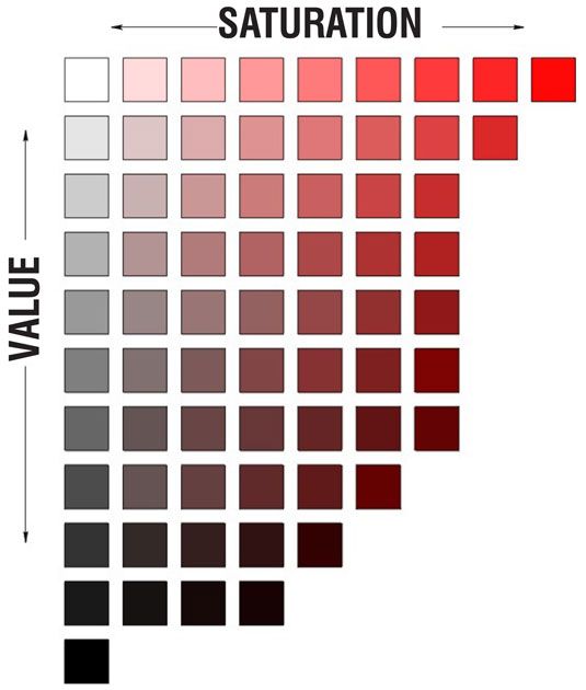
Value V.S. Saturation(intensity)One of the things that I find difficult to explain even though its not complicated is the difference between color saturation, and the value of a color. This image though below to me makes it about as clear as possible, soooo hope this helps to clear any questions that you may have about color saturation VS color value up.
Self Assessment essay
|

|
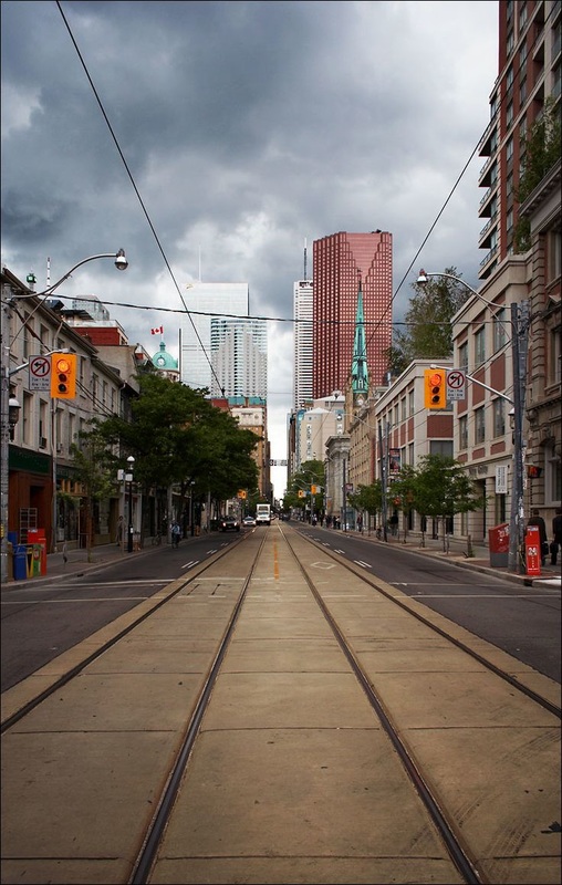
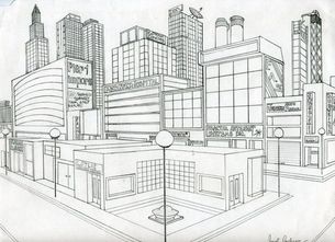
This video is NOT exciting......however it does very clearly show you how to create a city street in one point perspective.
The photo shown here is a good example of how this happens in real life.
|
Two point perspective

|
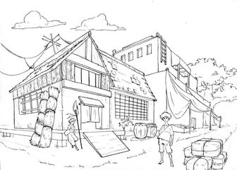
|
|
|


3 Point persepctive

|


|
4 Point persepctive

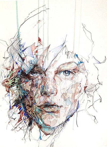
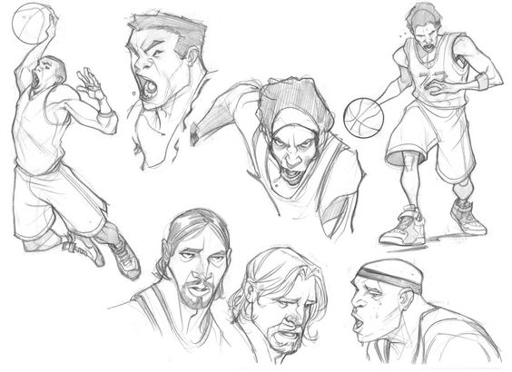
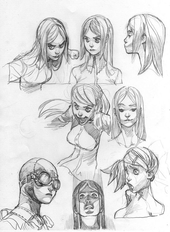
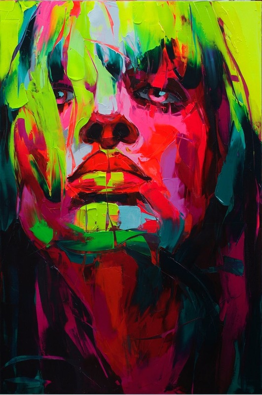
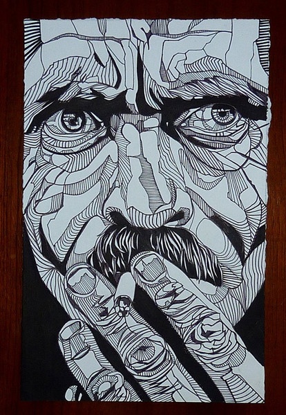
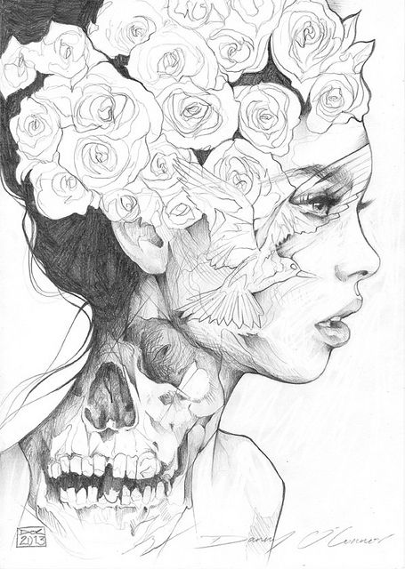
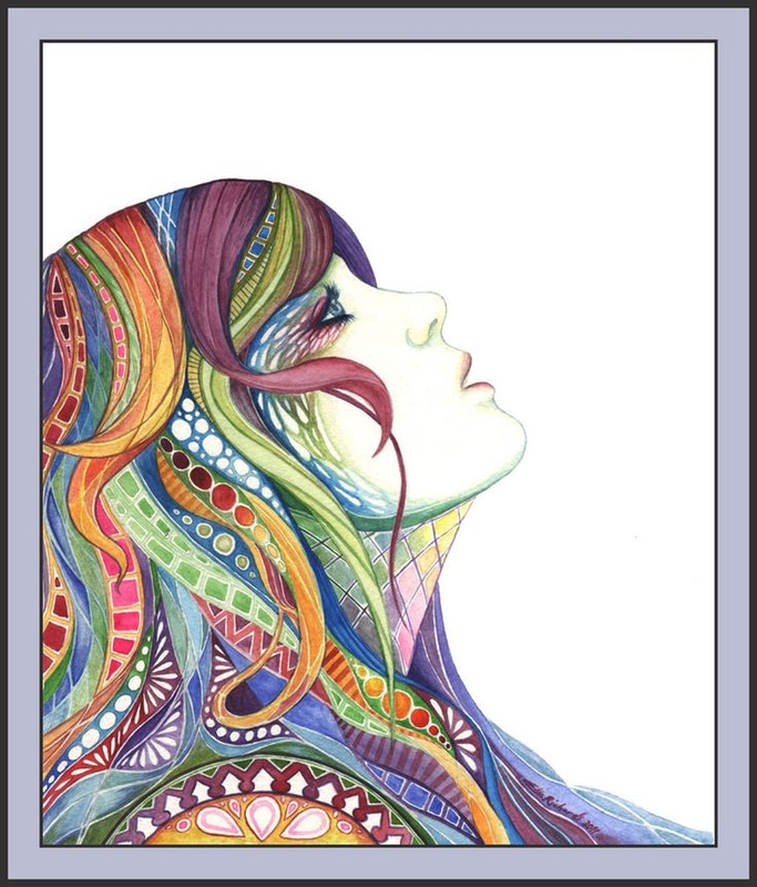
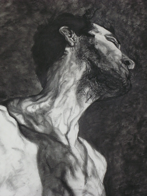
Self portraits
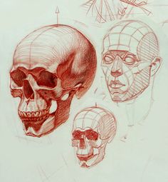
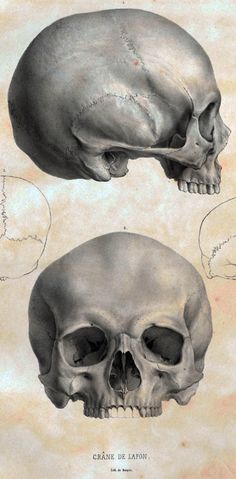
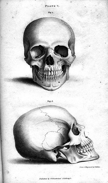
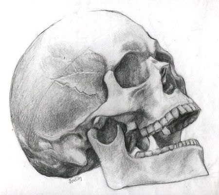
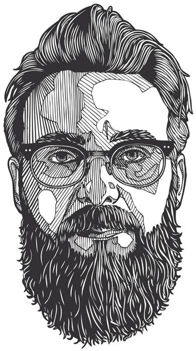
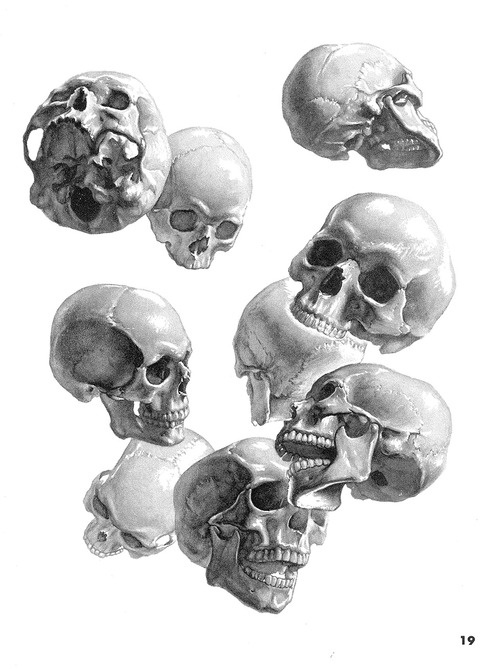
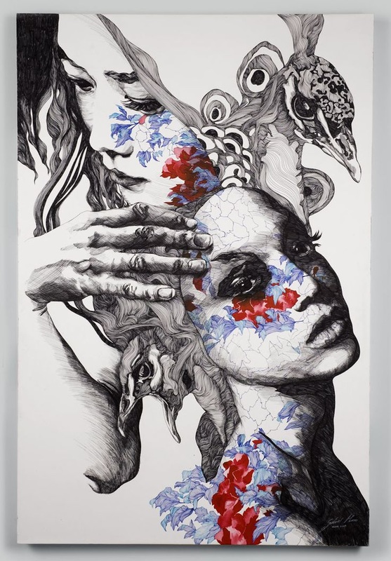
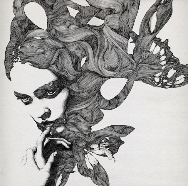
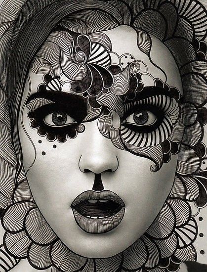
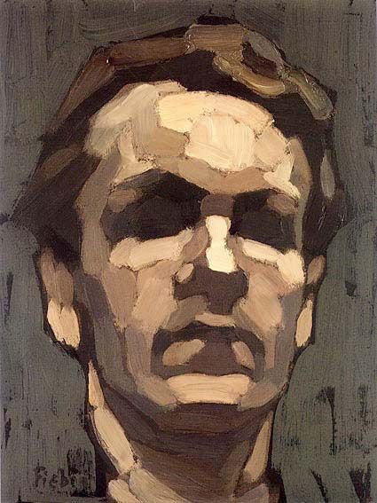
To start this project the first thing that must take place is the creation of a set of 10 studies of the face. Remembering that studies are small completed drawings, typically zoomed in to a specific area. To start off there must be an understanding of the basic facial structure, take a look at the structure of the skull shown bellow. All of the values that are present on the face are a direct result of the structural composition of the face as discussed in class.


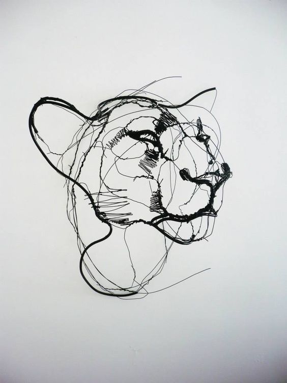
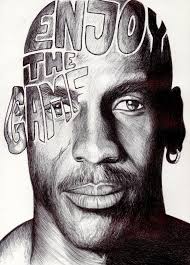
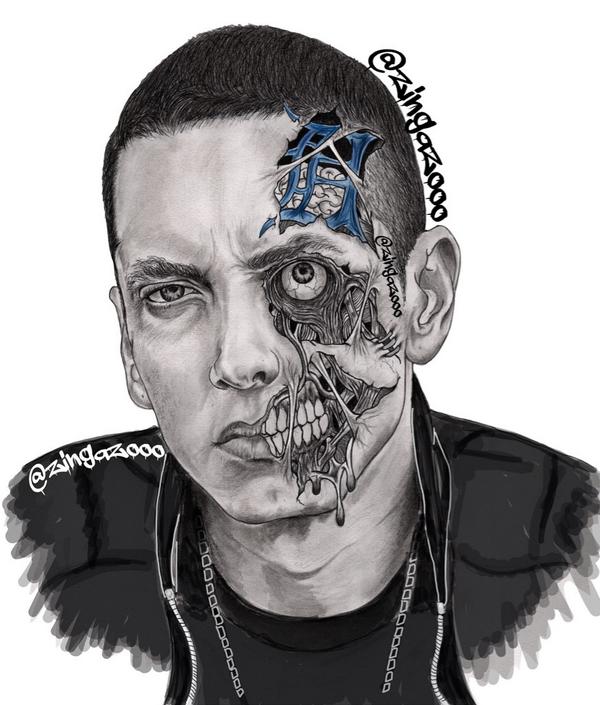
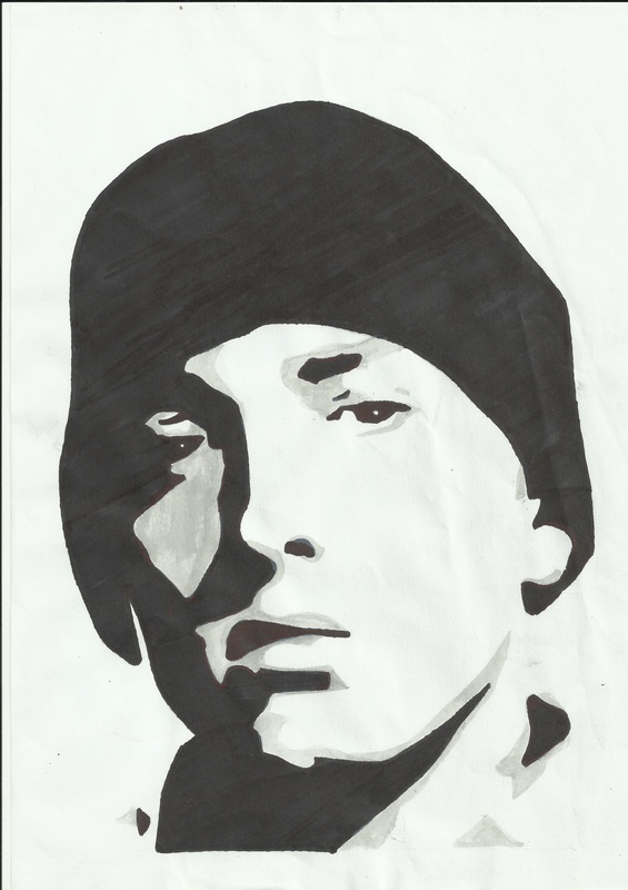
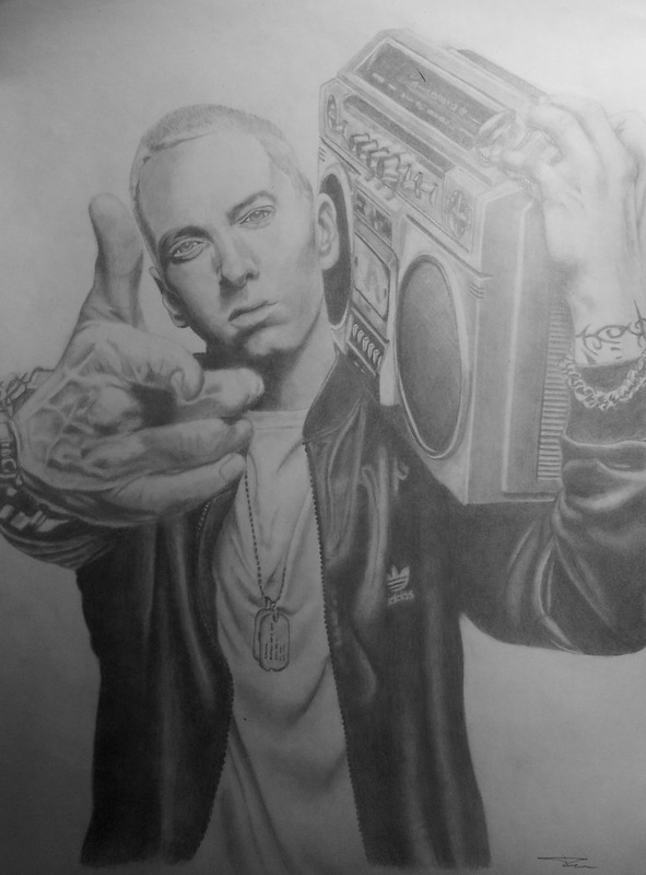
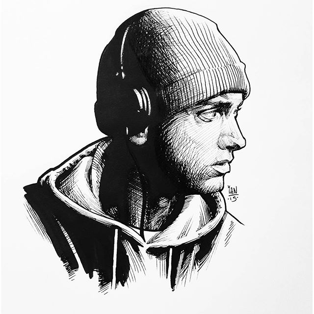
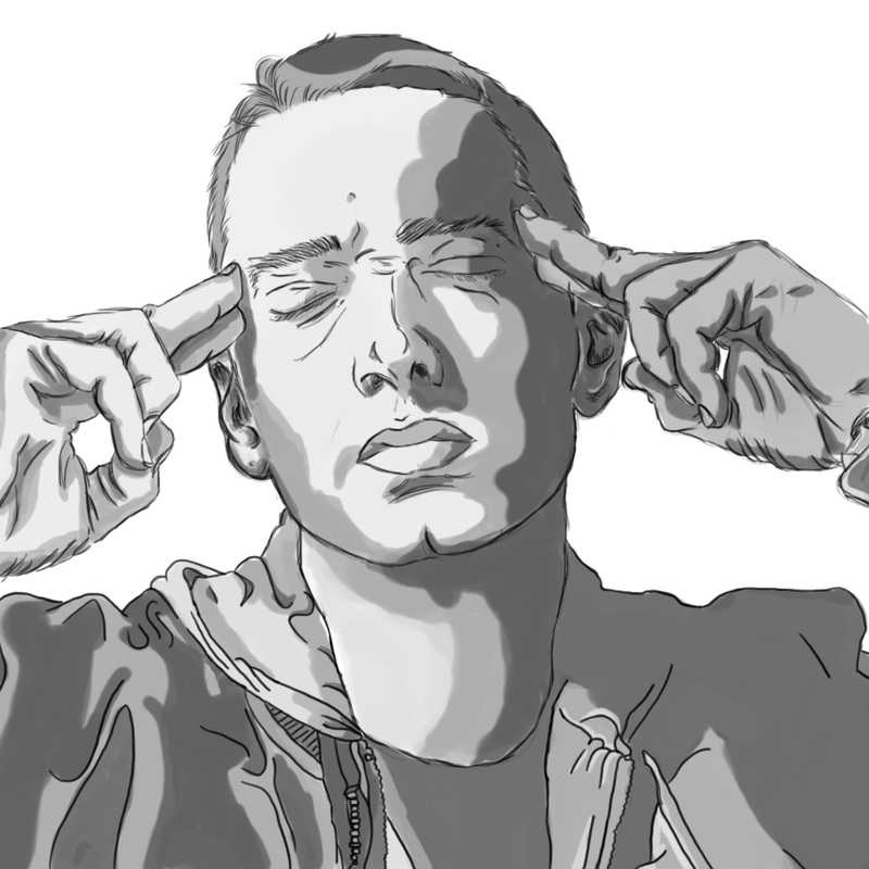
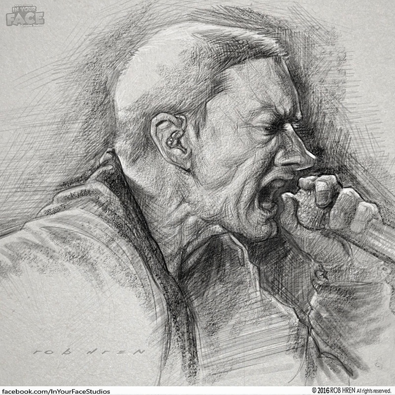
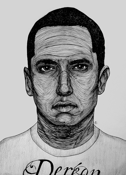
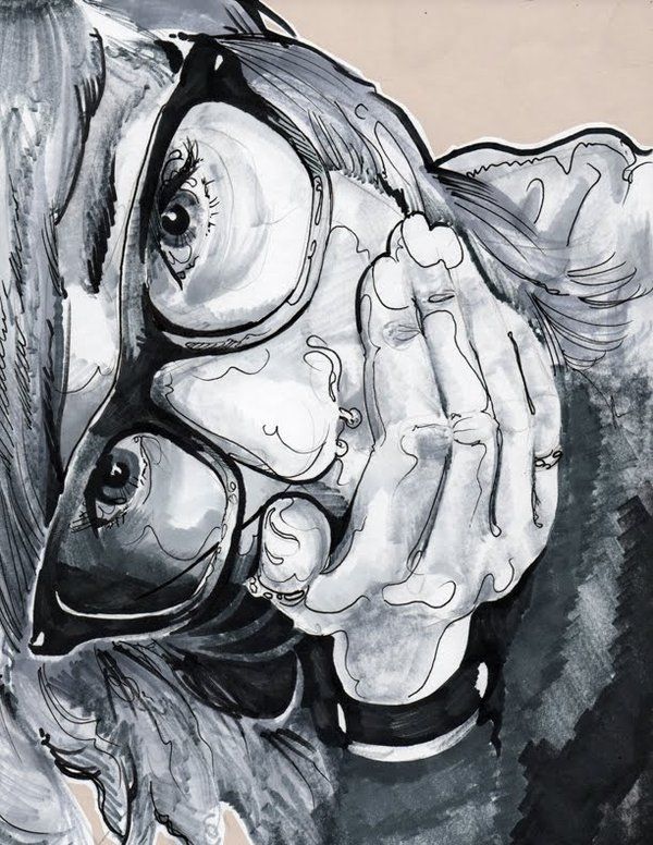
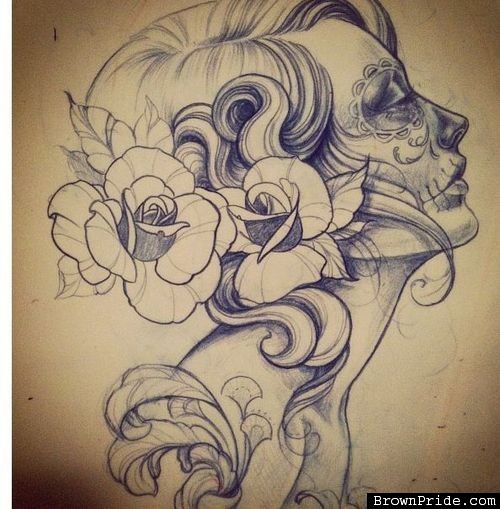
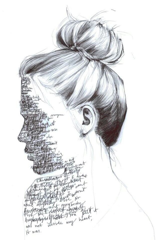
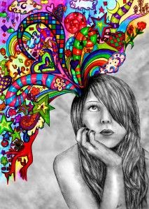
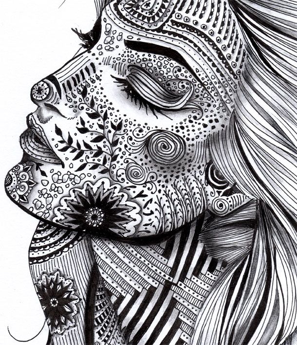
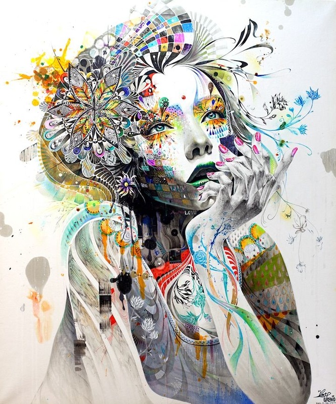
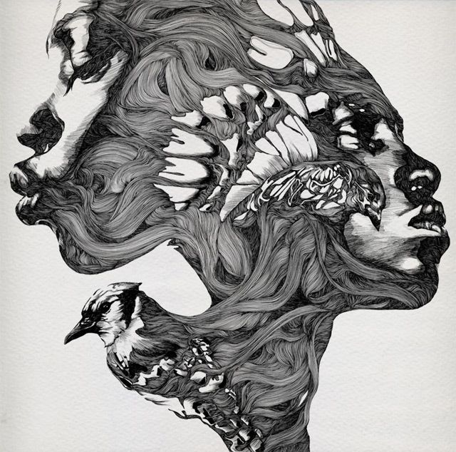
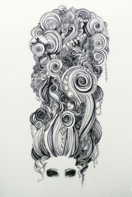
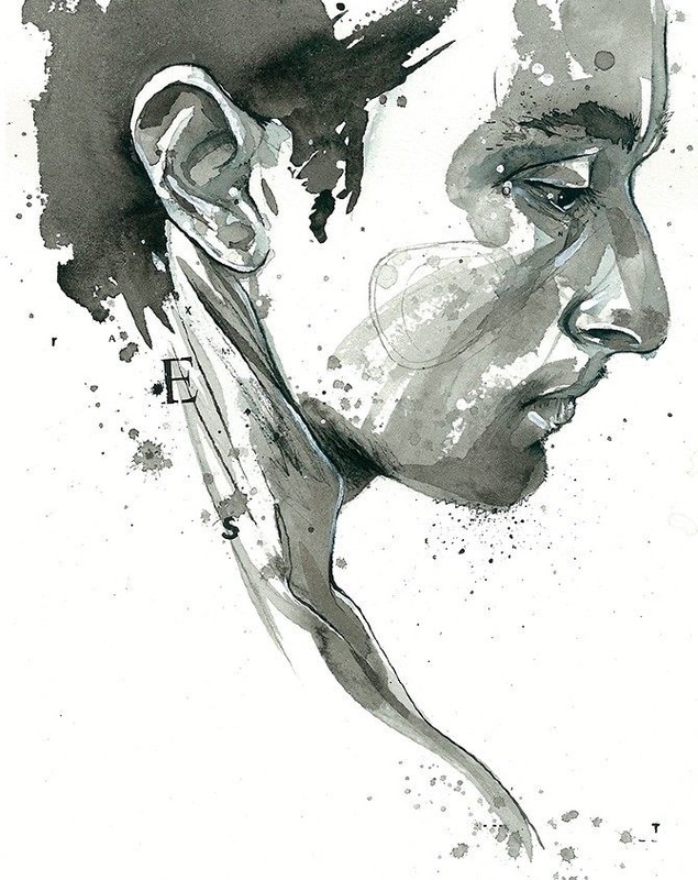
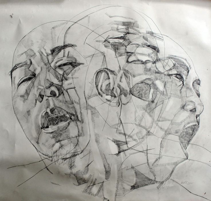
Creative self portraits.....EXAMPLES......

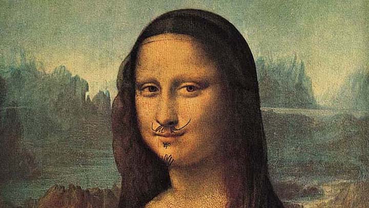
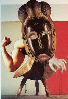
Dadaism
Dada was an artistic and literary movement that began in 1916 in Zurich, Switzerland. It arose as a reaction to World War I, and the nationalism, and rationalism, which many thought had brought war about. Influenced by ideas and innovations from several early avant-gardes -Cubism, Futurism, Constructivism, and Expressionism - its output was wildly diverse, ranging from performance art to poetry, photography, sculpture, painting and collage. Dada's aesthetic, marked by its mockery of materialistic and nationalistic attitudes, proved a powerful influence on artists in many cities, including Berlin, Hanover, Paris, New York and Cologne, all of which generated their own groups. The movement is believed to have dissipated with the arrival of Surrealist in France.
Key figures
Key figures
- Francis Picabia
- Marcel Duchamp
- Man Ray
- Andre' Breton
- Hans Arp
- Hugo Ball
- Hana Hoch
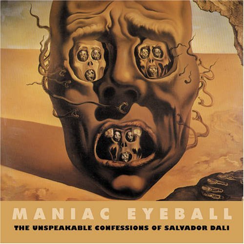
Due to the randomness of the images that where created, people where able to identify something that they could identify with in almost all of the work. This same process can be found in the Psychological Test known as the Rorschach test, or the ink blot test. Here to are images that are literally nothing. Nothing at all, they are a block of ink equivillant to that of a spilled glass or milk or a stain on the floor.


Oil Pastel
Oil pastel (also called wax oil crayon) is a painting and drawing medium with characteristics similar to pastels and wax crayons. Unlike "soft" or "French" pastel sticks, which are made with a gum or methyl cellulose binder, Oil pastels consist of pigment mixed with a non-drying oil and wax binder. the surface of an oil pastel painting is therefore less powdery, but more difficult to protect with a fixative. Oil pastels provide a harder edge then other pastels but are more difficult to blend.
Terminology for the Final
- Gradiated Value
- Step Value
- Hatching
- Cross hatching
- Stippling
- One Point Perspective
- Two Point Perspective
- Three Point Perspective
- Complimentary
- Split Complimentary
- Analogous
- Monochromatic
- Warm Colors
- Cool Colors
- Neutral Colors
- Tint
- Shade
- Hue
- Saturation
- Line
- Texture
- Color
- Value
- Space
- Shape
- Form
- Movement
- Balance
- Pattern
- Repetition
- Emphasis
- Contrast
- Unity
- Variety
- Rule of thirds
