Credit Recovery
Section one
Value
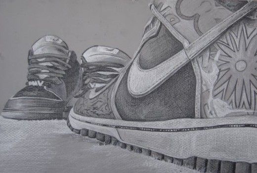
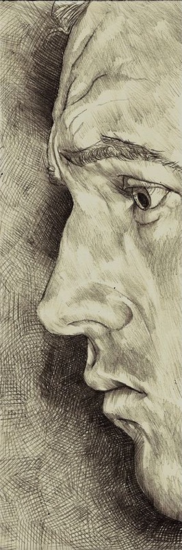
To start off we are going to work with value. When you think about value think about shadows, or the overall darkness/lightness of an object. We see in gradiated value, gradiated value is value that fades from one step into another often times without us being able to point to the exact place that it changes. Looking at the image below you can see that there are shadows on the shoes, however you can not point to the exact places that the shadows go from light to dark or dark to light in every single case. This is a good example of gradiated value, when we use this kind of value we simply look at an object and draw what we see as accurately as we can.
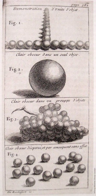
Step value however is a bit different, step value is what is called "flat value". Flat value is value that is actually contained within a shape. It never fades in and out the same area. Each value creates its own shape and the change from one value to the next creates a visible line of change between each value. Look at the image below, in this image you can see how each of the shadows are contained within themselves. None of the values fade from one into another.
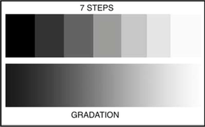
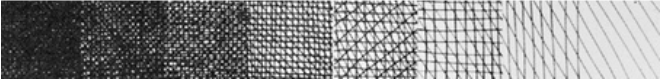
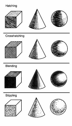
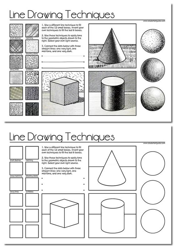
The third scale for this section is going to be cross-hatching which is actually not a kind of value but instead a technique that allows you to create value. Cross hatching can create step value and gradiated value through the use of line. In this 7 step scale you are going to start with 4 different directions as close as you can, then down to three, down to two, and then down to one still nice and tight. From there keep with whatever direction you choose and simply start to space out your lines. In crosshatching you create value based on how many different directions you go and how close your lines are.
The project for this section is to create one value scale in each of the three different types of value. One Gradiated, one step value, and one in crosshatching. Each value should be contained within a step in the scale. Each value scale should be 7 steps long, as shown below.
Section 2
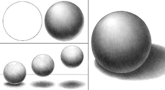
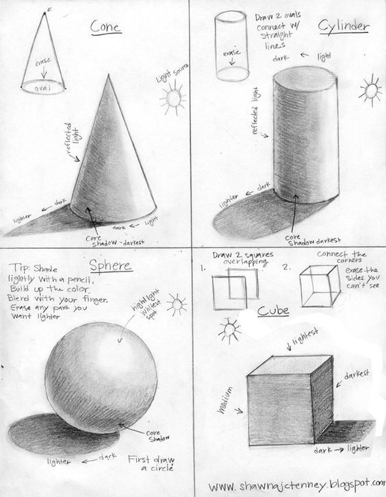
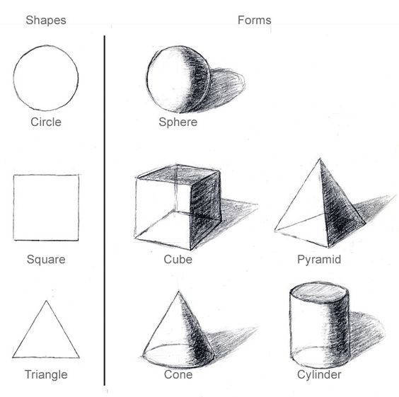
The second step to learning how to shade correctly is to now take what you learned from doing the value scales and start to apply that to forms. In taking the value and applying it to forms it enables you to see what each kind of value looks like in real application. The majority of the time we look at things in the real world in an overly complex manner. Almost everything that we see in our daily lives is built by someone or something(machine). All of these objects are in some way shape or form geometric and fall into the category of one or more of the following forms Sphere, Cylinder, Cone, and Cube. Look around the room you are currently in, there is almost nothing including the room itself that cant be broken down into these basic forms.
For the second section what you need to do is draw each of these forms in three rows. So the first row would be a sphere, cylinder, cone, and a cube shaded using gradiated value. The second would again be a sphere, cylinder, cone, and cube but this row would be shaded in step value. The last row would again be a sphere, cylinder, cone, and cube but shaded using cross hatching.
Bellow are just some examples to help you see exactly how each form will look in the different kinds of value. Some of these are better then others but the idea behind the shading in each of these is what I want you to look at. Each has a clear light source which is creating the shadow. Different surfaces will reflect light differently, we are not worrying about getting into fractured or refracted light. We are simply working with simple shading on a object that is absorbing some of the light and diffusing some of the light across its surface as the light hits the object.
Section 3
Section three we need to get a bit of vocab as well as a project, to start off with all work is based on two sets of vocabulary. One of the two sets is usually easier for people to comprehend. That would be the elements of art. Those are things like line, color, value, and texture......all things that are real and we can put our hands on, there are 7 Elements of art in total. The other set of terms are called the Principles of art. These are things that are more concept based like balance, proportion, repetition, pattern, and rhythm. In all there are 9 principles of design, when we use the two together in a purposeful manner they allow us to create a composition. A composition is simply put is a work of art. A drawing, painting, etching, even a photograph at its core is a purposeful combination of the elements and principles of art.
Elements of art
1. Shape = An element of art, an enclosed space defined by other art elements such as line, color, and texture.
2. Form = An element of art that appears three-dimensional and encloses volume such as a cube, sphere, pyramid or cylinder
3. Space = An element of art that indicates areas between, around, above, below, or within a composition, there are two kinds of space positive and negative.
4. Texture = is the surface quality of an artwork usually perceived through the sense of touch; however texture can also be implied, perceived visually though not felt through touch.
5. Line = An Element of art that is used to define space, contours and outlines or suggested mass and volume.
6. Color = An element of art with three properties: hue, value, and intensity. Also the character of surfaces created by the response of vision to wavelengths of reflected light
7. Value = an element of art concerned with the degree of lightness or darkness
Principles of Design
1. Unity = A principle of design related to the sense of wholeness that results from the successful combinations of the elements of art.
2. Variety = The use of several elements of design to hold the viewer’s attention and to guide the viewer’s eye through and around the work of art.
3. Emphasis = A principle of design in which one element, or a combination of elements, create more attention than anything else in a composition. The dominant element is usually a focal point in a composition and contributes to unity by suggesting that other elements are subordinate to it.
4. Balance = The equal distribution of positive and negative space throughout a work of art so that no portion of the work visually weighs more.
5. Proportion = A principle of art reflecting the size relationship of parts to one another and to a whole.
6. Pattern = The repetition of elements or combinations of elements in a recognizable organization, also could be the repeating of an object or symbol all over the work of art.
7. Rhythm = Is created when one or more elements of design are used repeatedly to create a feeling of organized movement. Rhythm creates a mood like music or dancing. To keep rhythm exciting and active, variety is essential.
8. Movement = The path the viewer’s eye takes through the work of art, often to focal areas. Such movement can be directed along lines, edges, shape, and color within the work of art.
9. Repetition = The repetition of elements of art to create unity within the work of art (line, color, shape, form).
section 3 project
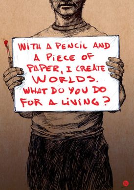
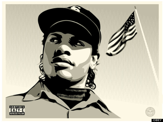
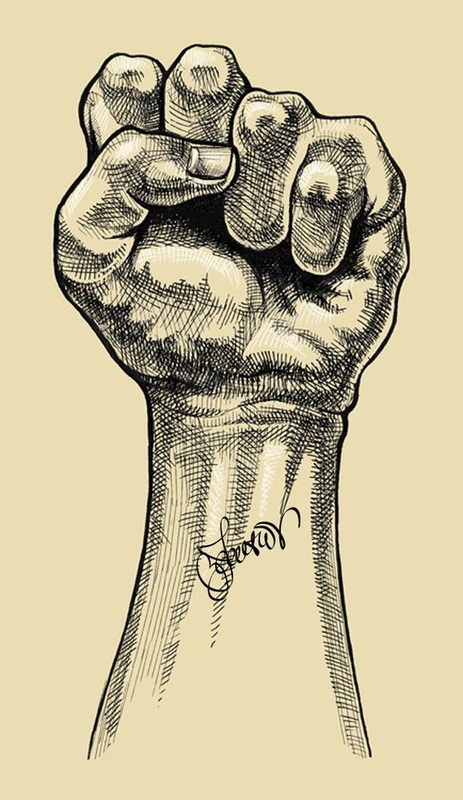
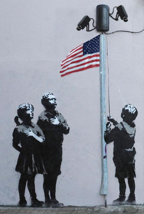
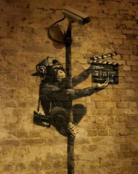
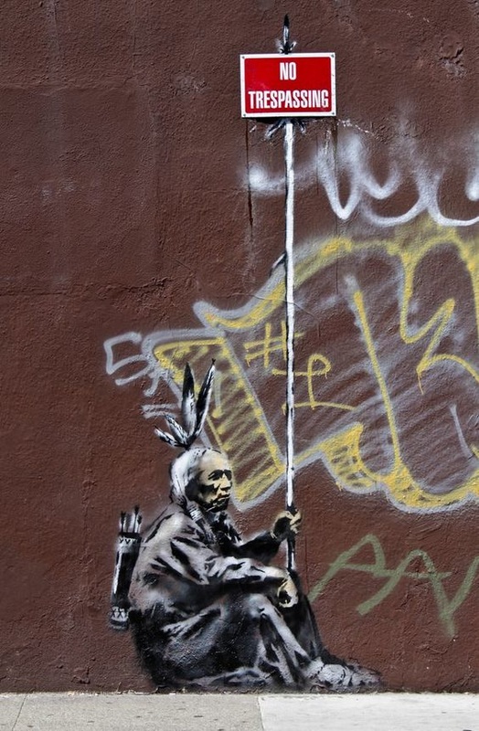
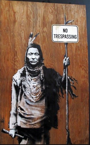
For the project portion of this section what you are going to do is create a composition (in this case a drawing) that incorporates your name into the work. The name portion does not have to be the focal point, however the work needs to be about you. Now when I say this people automatically think that this means you are going to do a drawing about the things you like, so for example the shoes you like, or the name brands you like, or the kind of car you like. That is not what I am talking about though. In order to do this project you need to think about it like this....if you had the opportunity to present one image to someone and that image is what you where going to be all the information they had about you. What would that one image be? Artists do this all the time, they take a very complex subject/issue/event and they sum it up into one clearly understandable image that conveys they message they want it to. One artist that deals with a lot of social issues that exist within the world and has become famous due to the street art movement is Banksy. A few examples of his work are shown bellow.
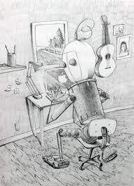
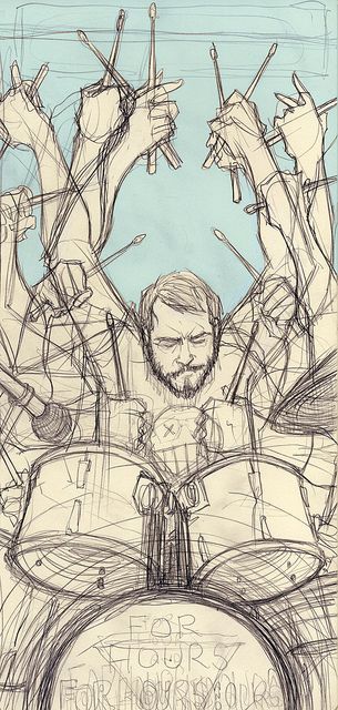
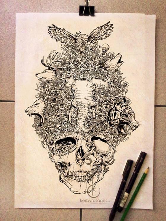
Numerous artists out there use this method though to create work that conveys a message. Combine what you learned in section one and two about value(graduated, step and crosshatching) with what you have just learned from the elements and principles of art to create a successful composition(drawing) that conveys who you are. Bellow are some other examples or approaches.
Section 4
Color Theory
Why? Why is color theory important? Well have you ever looked at a fast food restaurant? Notice anything?
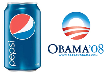
EVERY SINGLE ONE of these restaurants use the exact same colors. The only one that is even different at all is stake and shake but that ends on the outside of the restaurant because if you go inside its all red, yellow, and white. The reason for this is that the colors red and yellow when placed next to each cause a sub-conscience effect of eliciting hunger. Does this mean that you see the two colors and uncontrollably run after food? No but it does mean that it increases the chances from a statistical standpoint of you stopping and getting something to eat. Pepsi is another company that uses color and design to increase its sales. The company researches the hues of red and blue that each target generation responds to best and slowly changes their colors and logo to match up with that audiences preferences. Look at the Obama Campaigns last campaign log and look at the Pepsi logo that came about right around the same time.
This is not coincidence, this is market research and the direct correlation between color & design, and the impact that it has on human perception and product sales. Companies as well as artists of all kinds use color to their advantage all the time. It is a simple way of influencing a viewers thoughts, feelings or opinions. This reaches even as far as politics, think about it red = which party, blue = which party? Color influences everything that we do regardless of whether we realize it or not.
Section 4 project & vocab
Here is the vocab for color theory.
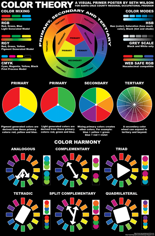
Color harmonies are different color combinations that have been identified as being pleasing to the human eye, these are often times referred to as color schemes as well as harmonies.
- Saturation = is the purity, vividness or intensity of a color.
- Value = is a variation in the dark and light of color made by adding black and white to the color.
- Hue = the attribute of a color by virtue of which it is discernible as red, green, etc., and which is dependent on its dominant wavelength, and independent of intensity or lightness.
Color harmonies are different color combinations that have been identified as being pleasing to the human eye, these are often times referred to as color schemes as well as harmonies.
- Analogous = are colors that are next to each other on the color wheel and are closely related, such as yellow, yellow-orange, orange-yellow, and orange.
- Complimentary = are two colors that are directly opposite each other on the color wheel, meaning they are in extreme contrast with each other.
- Split Complimentary = colors directly across from each other on the color wheel, except in this case it is a color that is combined with hues on either side of its complement.
- Monochromatic = is one color that is modified by changing the values and saturation of the hue by additions of black and white.
- Warm = Red, orange, and yellow
- Cool = Blue, green, and purple
- Neutral = Black, White, Grey, Brown
- Tint = is a variation in the dark and light of color made by adding white to the color.
- Shade = is a variation in the dark and light of color made by adding black to the color.
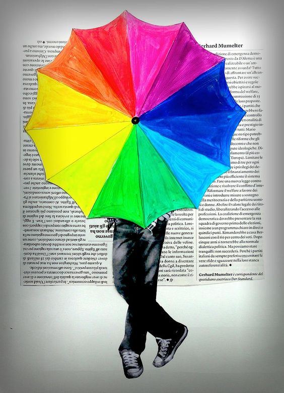
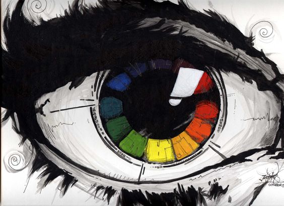
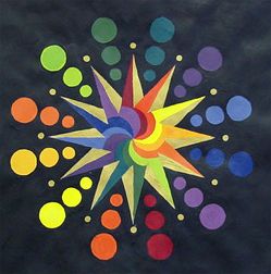
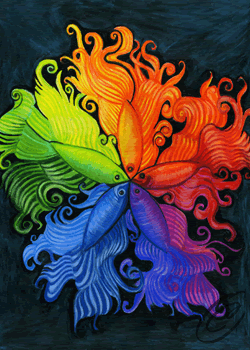
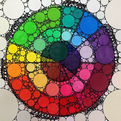
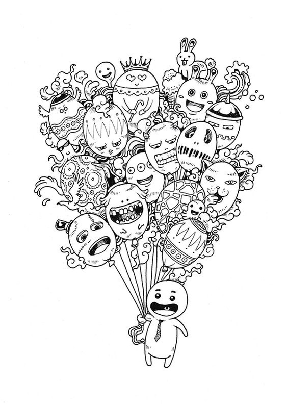
All of these terms are clearly represented in the color wheel, the project for this section is going to be to create a creative color wheel. What that means is that you need to find a way to incorporate the color wheel into an image in some way. The wheel itself must remain circular but the rest of the color harmonies(also called color schemes) may be fit in to the image in whatever way you want. One example that a student did in the past that I wish I had a picture of was of Flavor Flav from Run DMC. They had him holding up his clock necklace with both hands showing and a huge smile on his face. The clock is where they put the color wheel. They put the different color schemes in his teeth, and they did a monochromatic value scale using his rings on each finger. They then did a tint and shade of each color in the remaining space around him. If you look up Creative color wheel on google you will also find a lot of different examples of ways that people have done this, remember though the wheel itself must remain circular though. You will see some images and examples where people have made it linear and to start out that wont work.
So to sum this up the things that you must include in this are
1. The color wheel (at minimum the primary and secondary colors)
2. An example of an analogous color scheme (2-4 colors)
3. Complimentary color scheme (2 colors)
4. Split complimentary color scheme (3 colors)
5. Warm color scheme (3 colors)
6. Cool color scheme (3 colors)
7. Neutral color scheme (4 colors)
8. A tint of each color on the color wheel
9. A shade of each color on the color wheel